While this common progression was the general guideline in which I directed my design process, as I'm sure anyone viewing this will know, there was never a point where linearity became the norm. Constant retracing of steps to were habitual to accommodate feedback and new ideas. Once solidified ideas were trashed. Old concepts were constantly being reconsidered.
Competitor Analysis
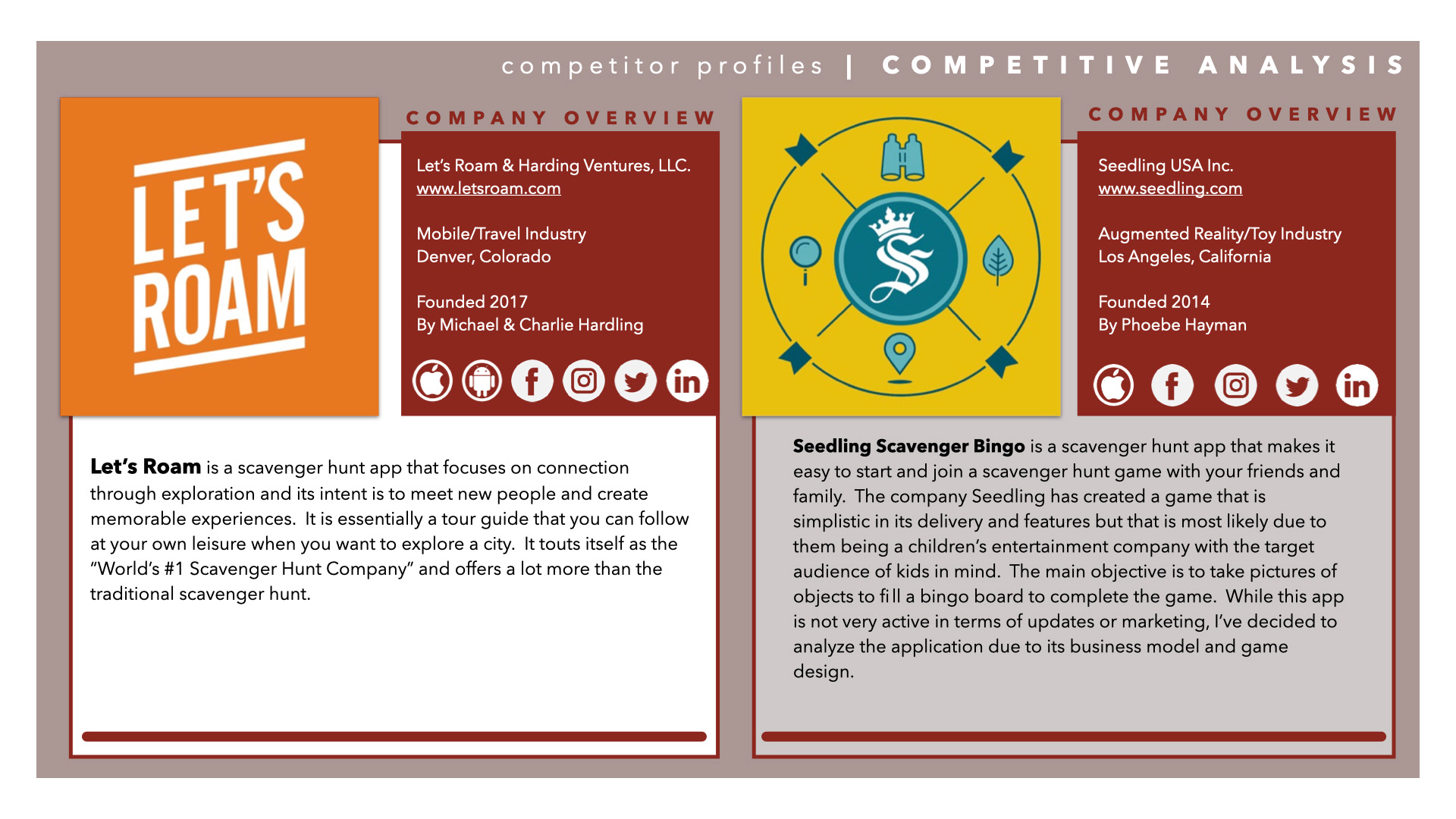
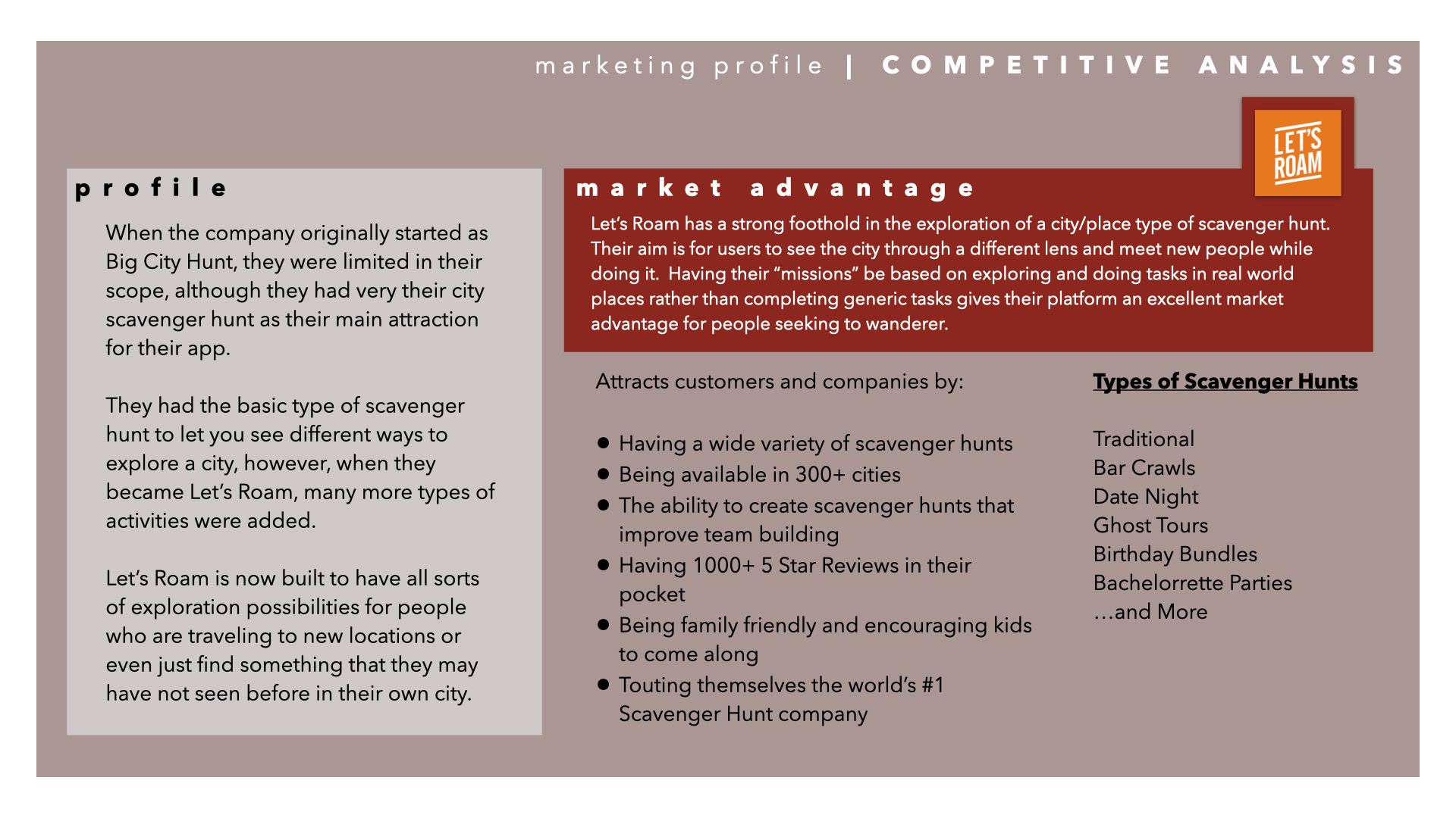
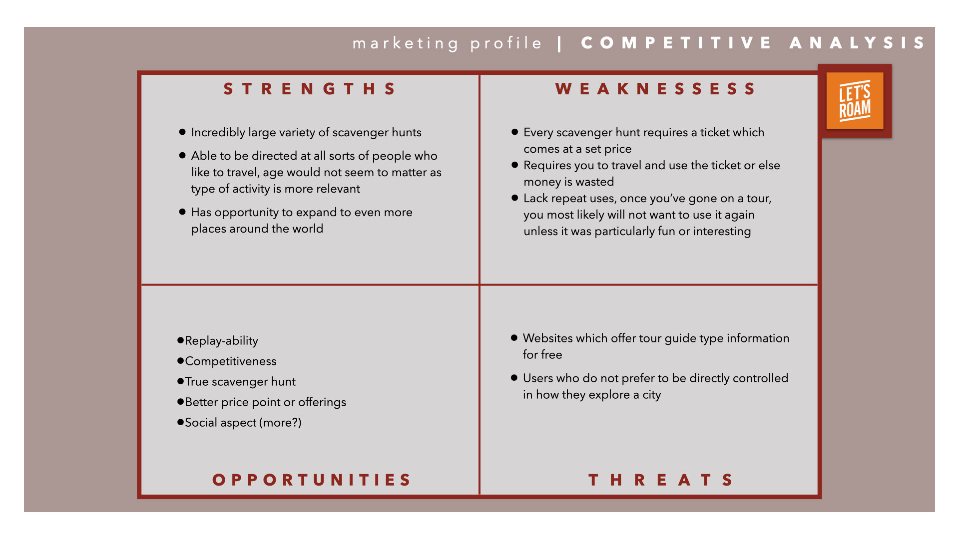
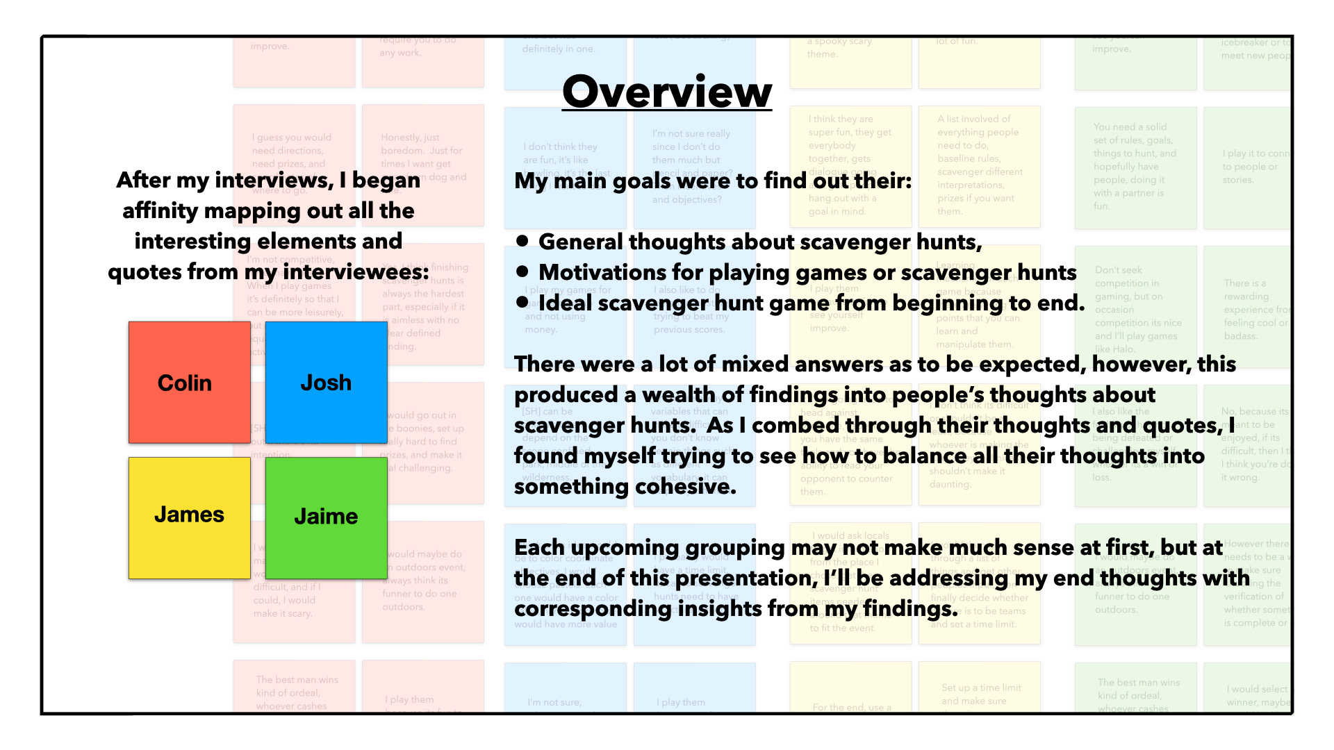
After identifying concrete research goals, I moved onto performing some user interviews. I produced an interview script and interview questions that would give me a better understanding of what others thought about scavenger hunts and gaming in general. I used questions that would reveal their thoughts about motivations for participating in scavenger hunts, what drives them in gaming, in general, their ideal scavenger hunt.
Affinity Mapping Results
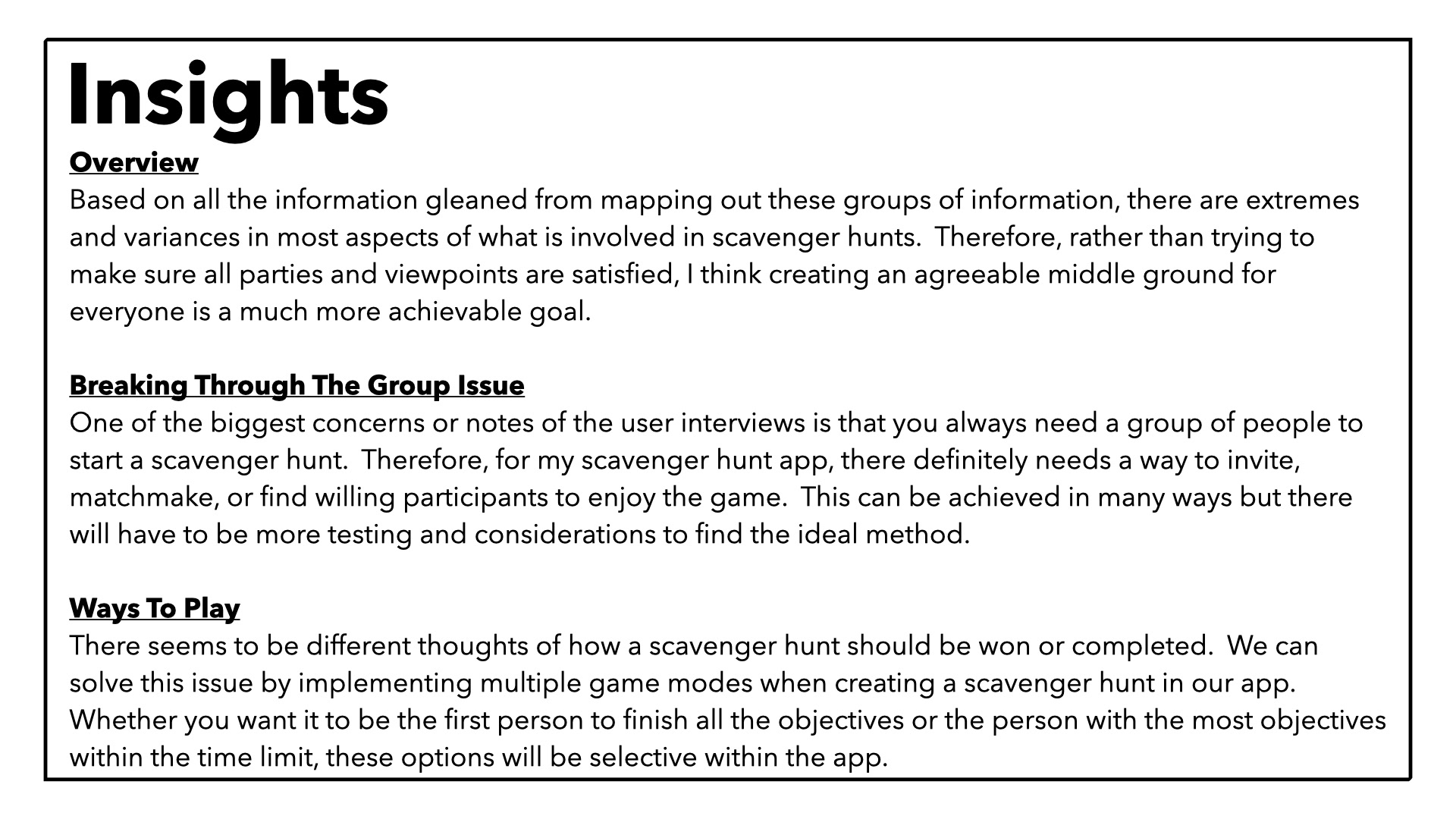
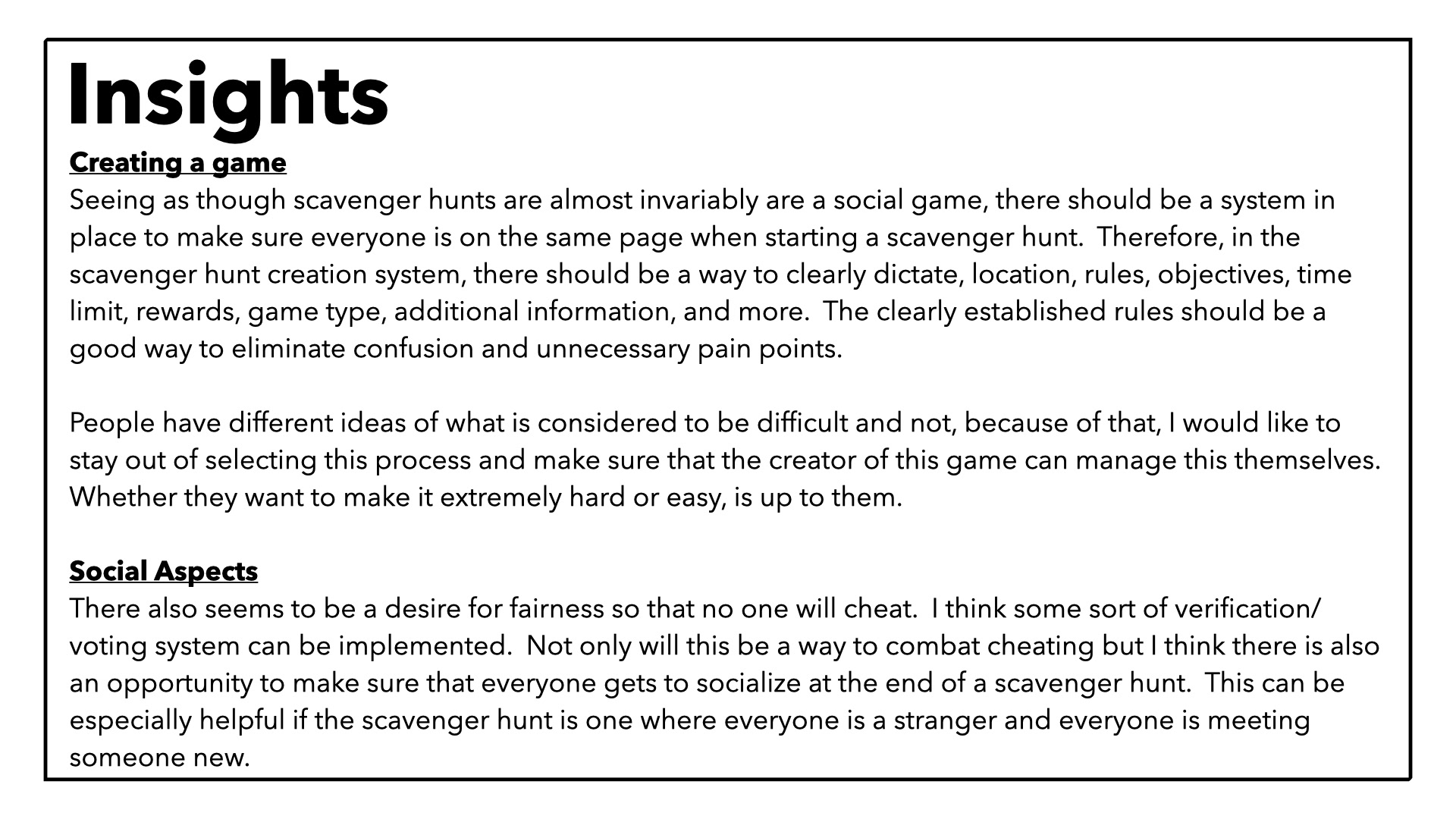
After basic preliminary research, I was able to draft up a business requirement document detailing the target audience, competition, risk, opportunities, project, scope, functional requirements, schedule and more. Once it was decided on what was missing in the landscape of scavenger hunt apps, I was able to delve into user personas and stories that would help prove my hypotheses.
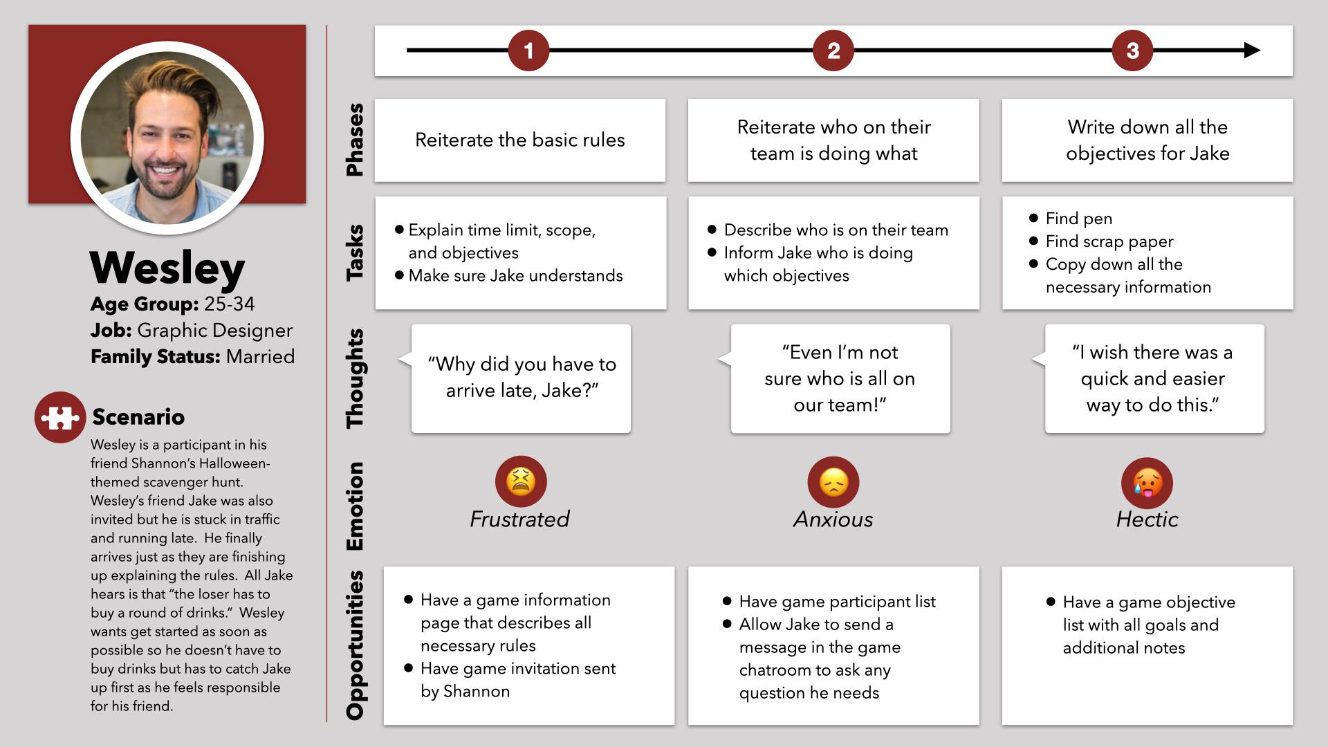
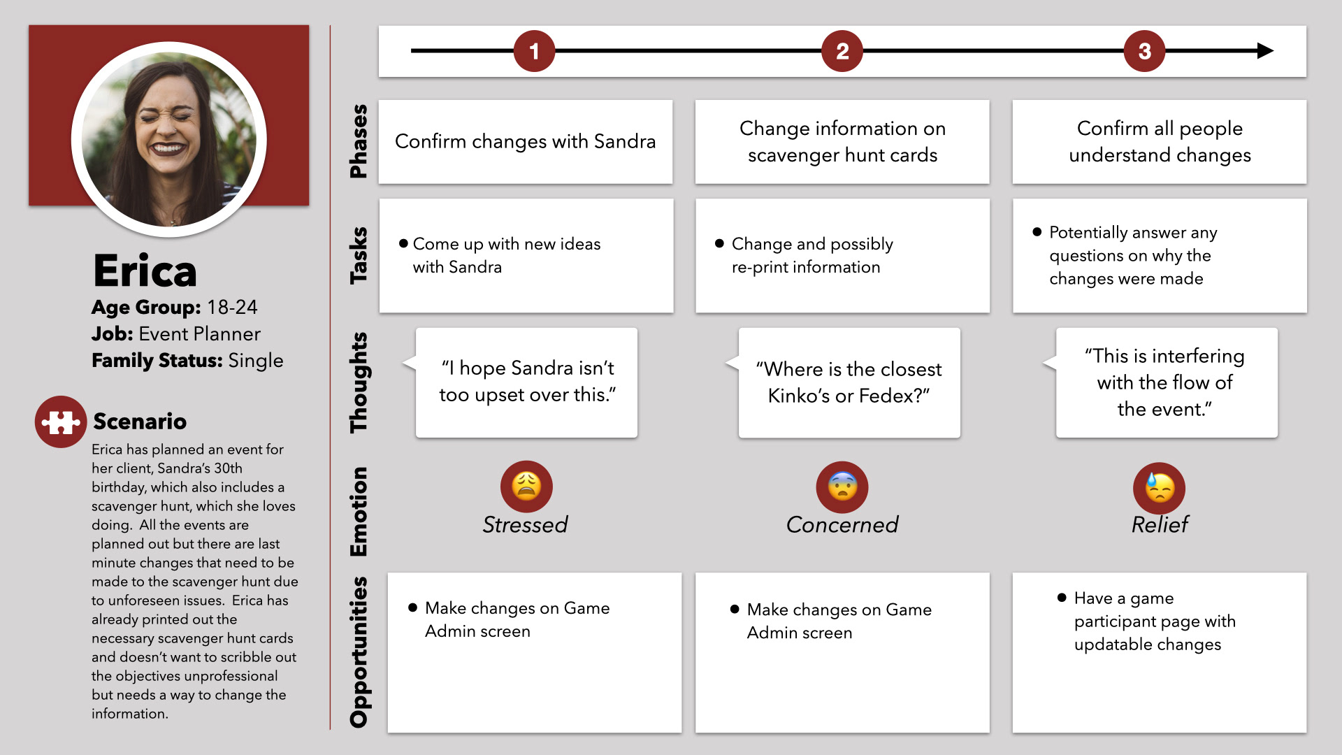
User Personas
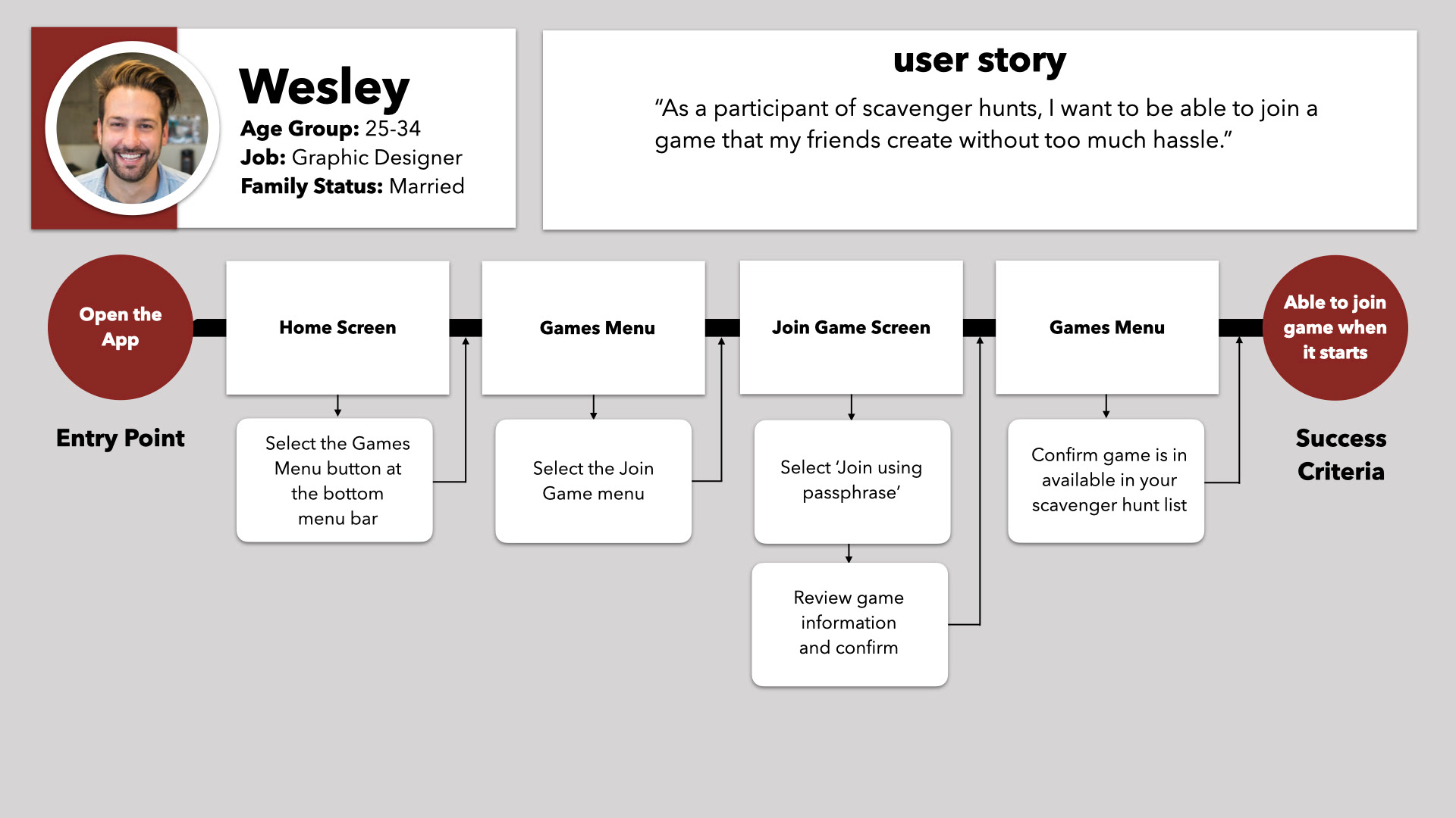
After creating my personas, I started working on journey maps to replicate their life without the Wayward Hunt app to see the gaps or opportunities a digital scavenger hunt might have to offer. I also was able to develop task flows based on analyzing the common activities that my user personas might encounter.
Card Sorting via Optimalhub.com
I concluded my core planning portion of my design by creating a card sort for users to help organize the site map. There were varying answers and with such a small user pool, so I didn't get any widely-approved results as I hoped I would. While I only used card sorting for studying my information architecture, I really would like to see this applied for other categories in the future. Also, I would try to conduct in-person card sorting or at least reach out afterwards to some participants to ask them about why they made their decisions.
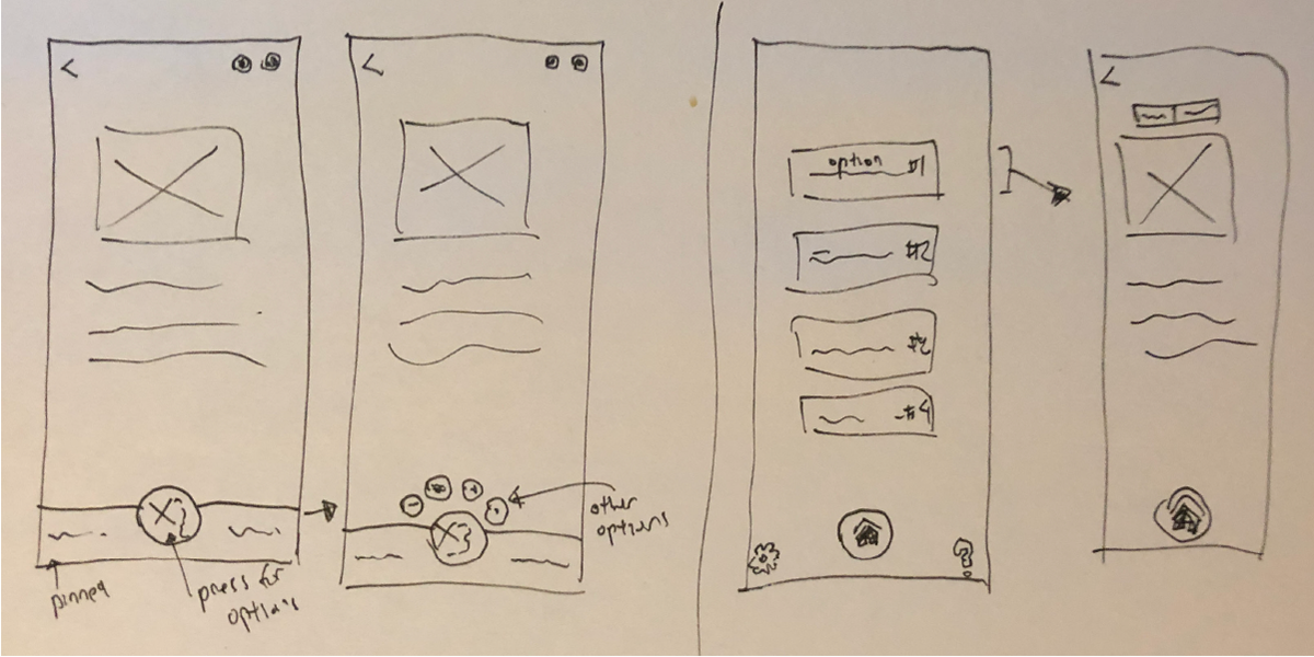
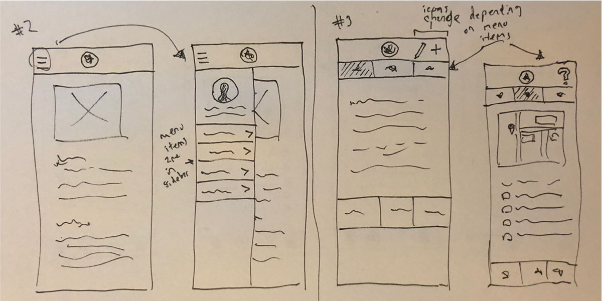
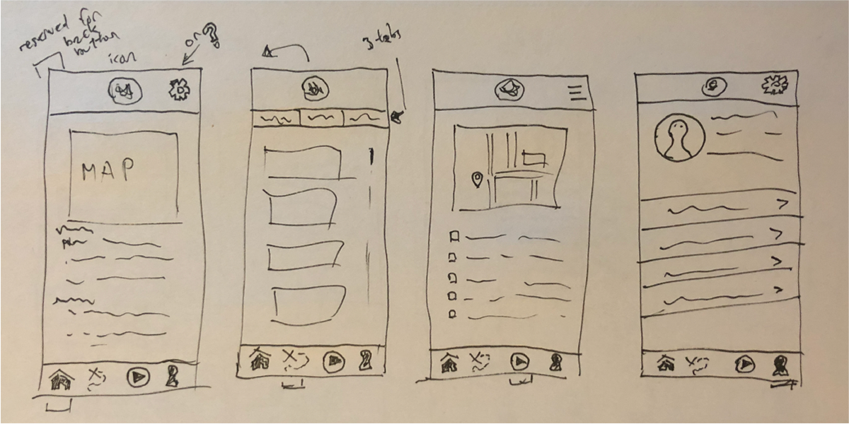
I started to sketch out some basic ideas for various screen ideas and functions to bring some basic concepts to life. Without being too detailed or unyielding on how the design would be structured, I made sure that I still had leeway for potential changes. I tried to keep in mind the information and needs that were gleaned from developing user personas and my user interviews.
Low-Fidelity Wireframes
Originally, I had some lofty goals that I had in mind. Remember when I said that randomization was in the works of how I wanted to direct Wayward Hunt? Well, I originally wanted a game randomization system where scavenger hunts could be created using randomly generated values. This would have been quite nice in practice but honestly - it was way more work than I had imagined. It would require me to create a database of objects and colors and then testing to make sure that each aspect made sense. I would even need to consult with an engineer or programmer to make sure my idea would actual function but did not have that luxury in this case. Well, sometimes you just have to be okay with getting rid of your ideas.
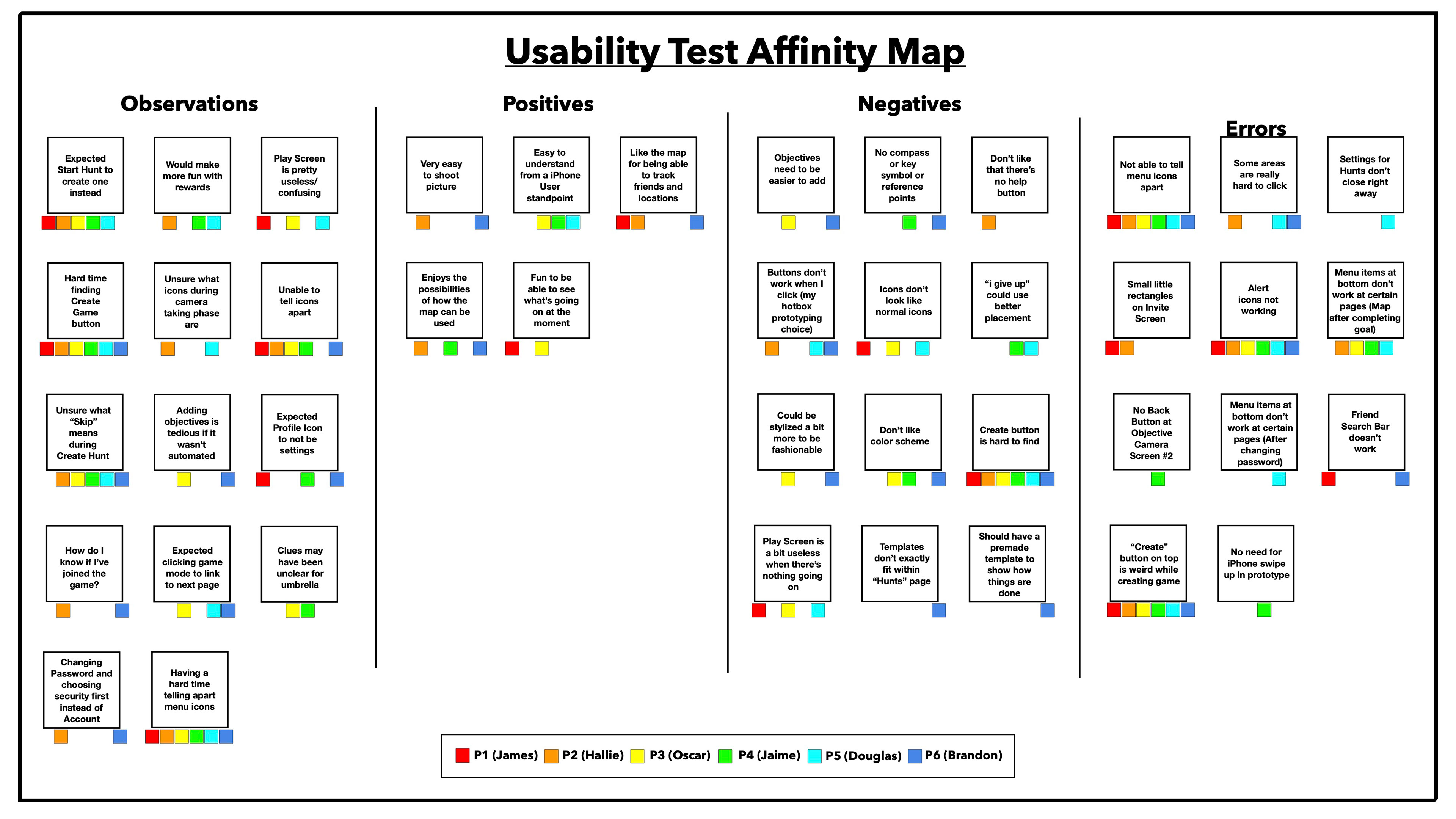
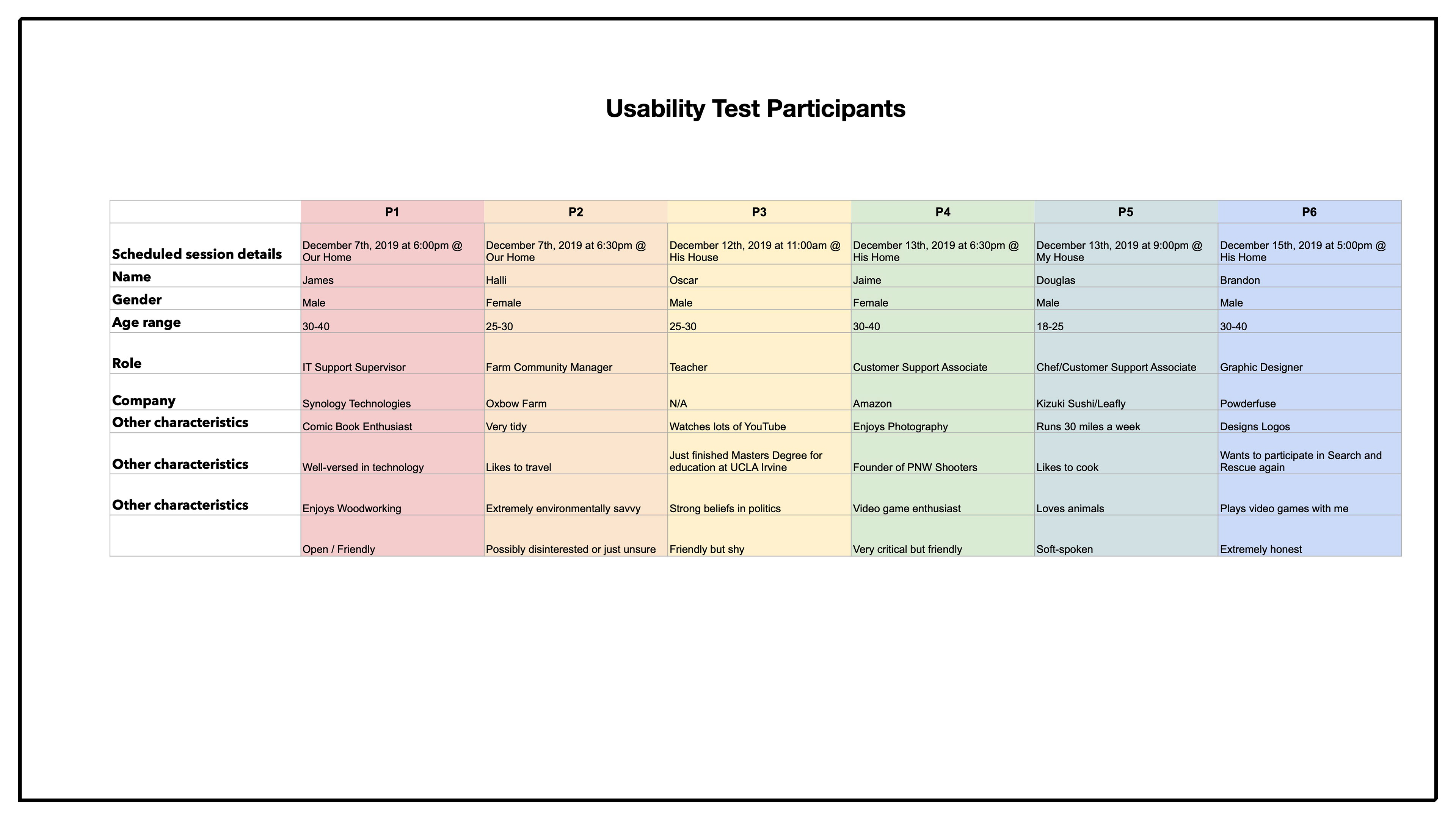
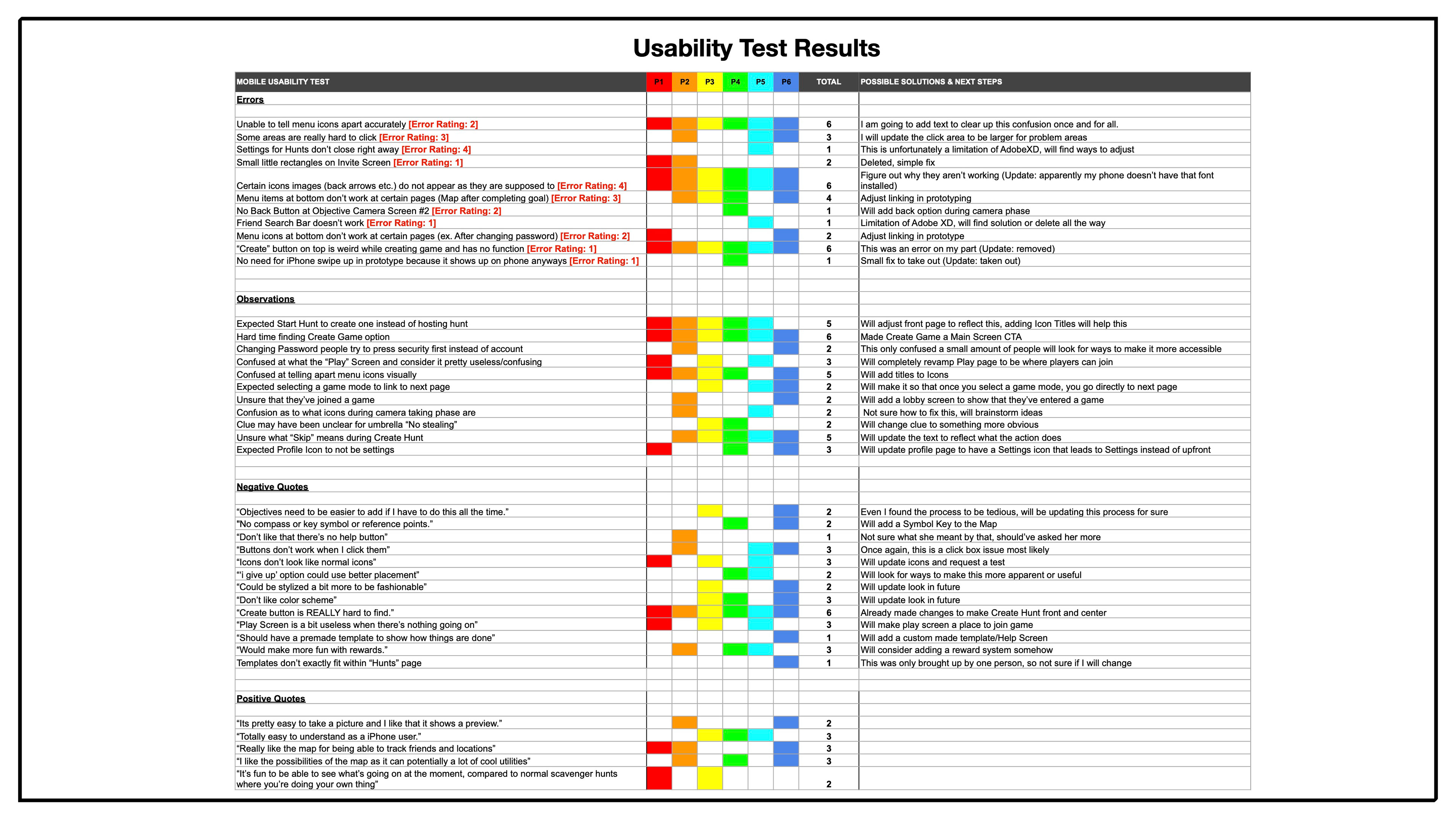
For my usability testing, I was hoping that users would be able to navigate through my app and perform basic scavenger hunt tasks. To prepare for the whole testing process, I drafted an informed consent form, a recruiting email, and finally a confirmation email detailing the usability testing session, dates and other pertinent information. A usability test plan was also laid out for mainly myself but would be useful fo stakeholders in the future regarding the participants, goals, session details and equipment needed. A basic test script was also written to provide guidance for both myself and the participants, so that every usability test is consistent.
A/B Preference Test for Onboarding via Usabilityhub.com
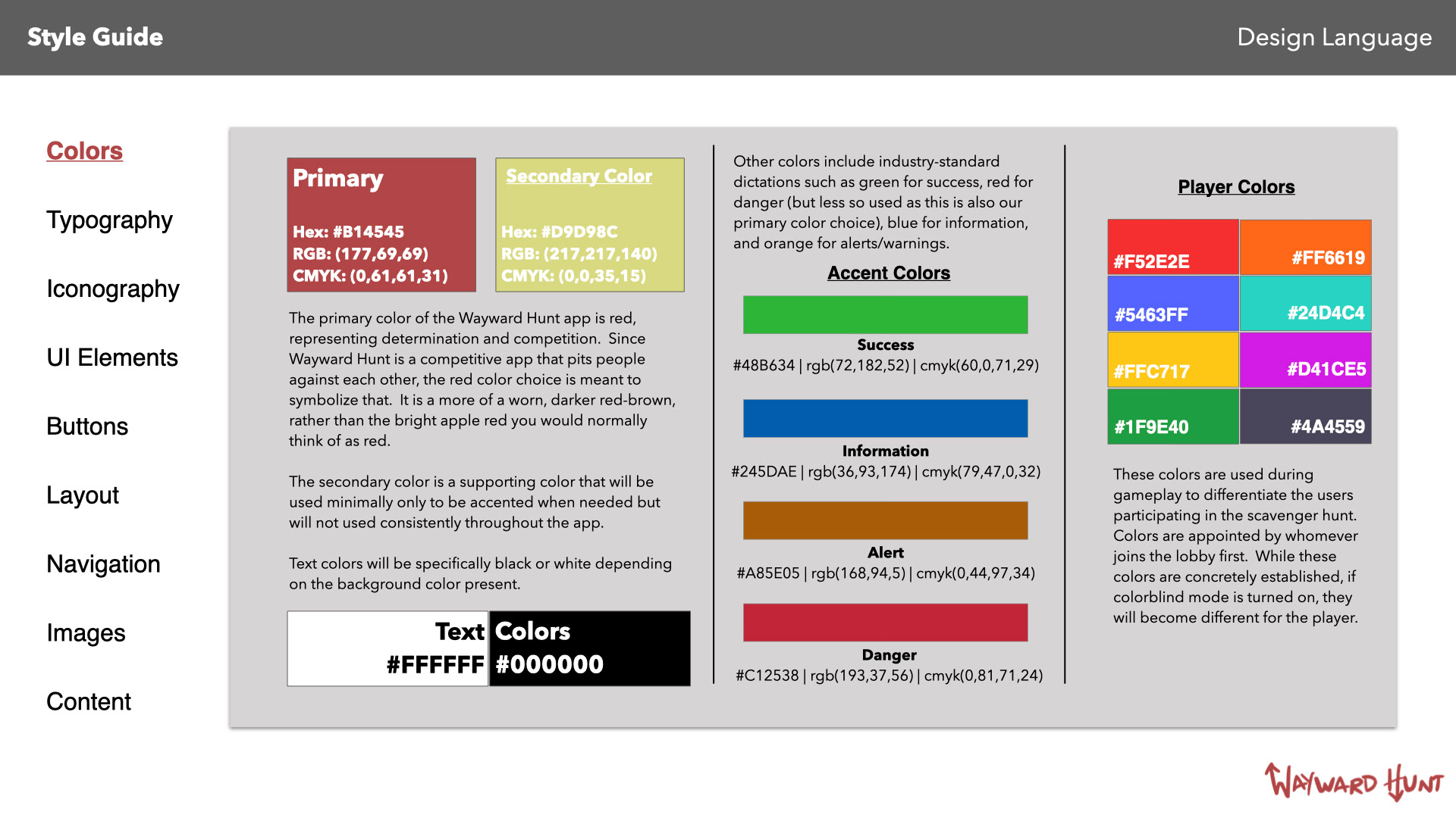
Design Pattern Libraries
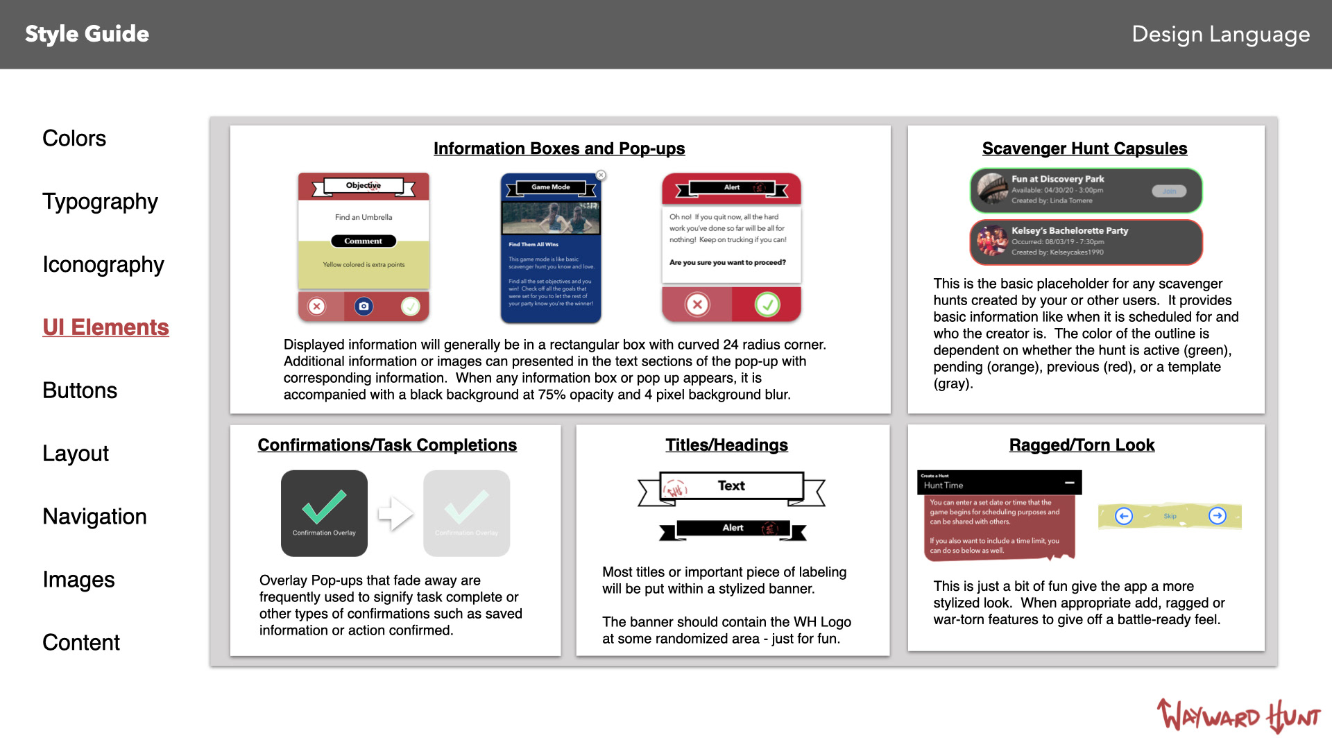
You can view and interact with the prototype by clicking here.


