

Client:
CareerFoundry
Duration:
4 weeks (06.2019)
Type:
Responsive Web Application
My Role:
UX/UI Designer
Contributions:
User Interface Design
User Experience Design
Brand and Pattern Design
T H E P R O J E C T
Motivate people into an exercise routine that suits their level, schedule, and interests. People need a way to find activities they like and get into a routine of doing them, which can be very helpful through a responsive web app. By using the app, the individual should feel motivated to become healthy and enjoy the associated benefits of exercising daily.
Target User: Exercise and Stretching Enthusiasts
Challenges
How do I get users to search and view routines, guides, daily challenges, and other info that will motivate them to exercise?
Solutions
Have a design that tightly revolves around your personal profile and has a community-driven system of learning, achievements, and more.
How to get users to get into a routine that suits their needs and lifestyle?
Give users the feature to choose individual exercises at the base level, combine multiple to create a workout, and the ability to them apply that routine to a calendar or routine.
How can I make it so that users can practice exercise routines at home, in the park, on the street, or anywhere?
Ensure that the web app is usable with multiple breakpoints and the features are consistent no matter what device you are using.
P R O B L E M
Self-Empathizing (Selfish Desires, Really)
Feeling Strongly About Stretching Habits
The concept of having a stretching app is something that I genuinely wanted to create. After not stretching for over 20+ years and having a relatively sedentary lifestyle - I was always stiff as a board and couldn't touch my toes.
Once I decided that had to change, starting a stretching routine was the best quality of life improvement decision I have ever made. Spreading my passion for increasing flexibility in people's daily lives is something I wanted to inspire. I now had to translate that desire into usability and functionality in an app.
Separate From The Yoga Apps
Finding a Niche In Comparative Analysis
Seeing as my concept was a little different than normal exercise apps, as it was completely focused on stretching - I researched both a combination of weightlifting and yoga apps to get more insights.
There were many factors that I had to make invalid as part of the comparison because the apps I researched had different user goals. For example, some yoga apps had more guided routines and workout apps had none.
Insight #1
Less Talky, More Stretchy
Most stretching apps on the market are focused on Yoga and different flows - not specifically stretching. There are some apps that have a collection of stretching positions but they're not detailed and don't always have video guidance.
Result: Create a database with detailed stretching info that can be categorized using tags. Along with having guides that are available in text, video, and audio for increased accessibility.
Insight #2
Created, Not Directed Routines
There are a lot of apps that have guided stretching routines but very few have features in bodybuilding apps, such creating your own workout routine.
Result: Focus on stretch routine creation with customizable and sharing features.
Insight #3
Search, Filter, Add
While there are apps with databases with stretches available, there is a lack of features to search for stretching routines that pertain to the user's level of flexibility and comfort.
Result: Implement a search system that has capabilities to filter and search for specific body parts, areas of improvement, pain tolerance, and other factors that apply to stretching.
R E S E A R C H
What Seems To Be The Problem Here?
Laying Out User Stories To Clear Things Up
"As a new user, I want to learn about different exercises, so that I can figure out what is best for me."
"As a frequent user, I want to be able to earn achievements or rewards, so that I can stay motivated."
"As a new user, I want to be shown how the exercises are done, so that I know I’m doing them correctly."
"As a frequent user, I want to track progression and record what I’ve done, so that I can see my progress over time."
They were all pretty basic requests for a typical workout app that you might see. The general gist of the user stories was targeted at new and frequent users looking to keep motivated through improved learning, progression tracking, social network sharing, and workout schedule. Since there was no restriction on what kind of exercise, I chose stretching as a personal choice.
Straightening Out The User
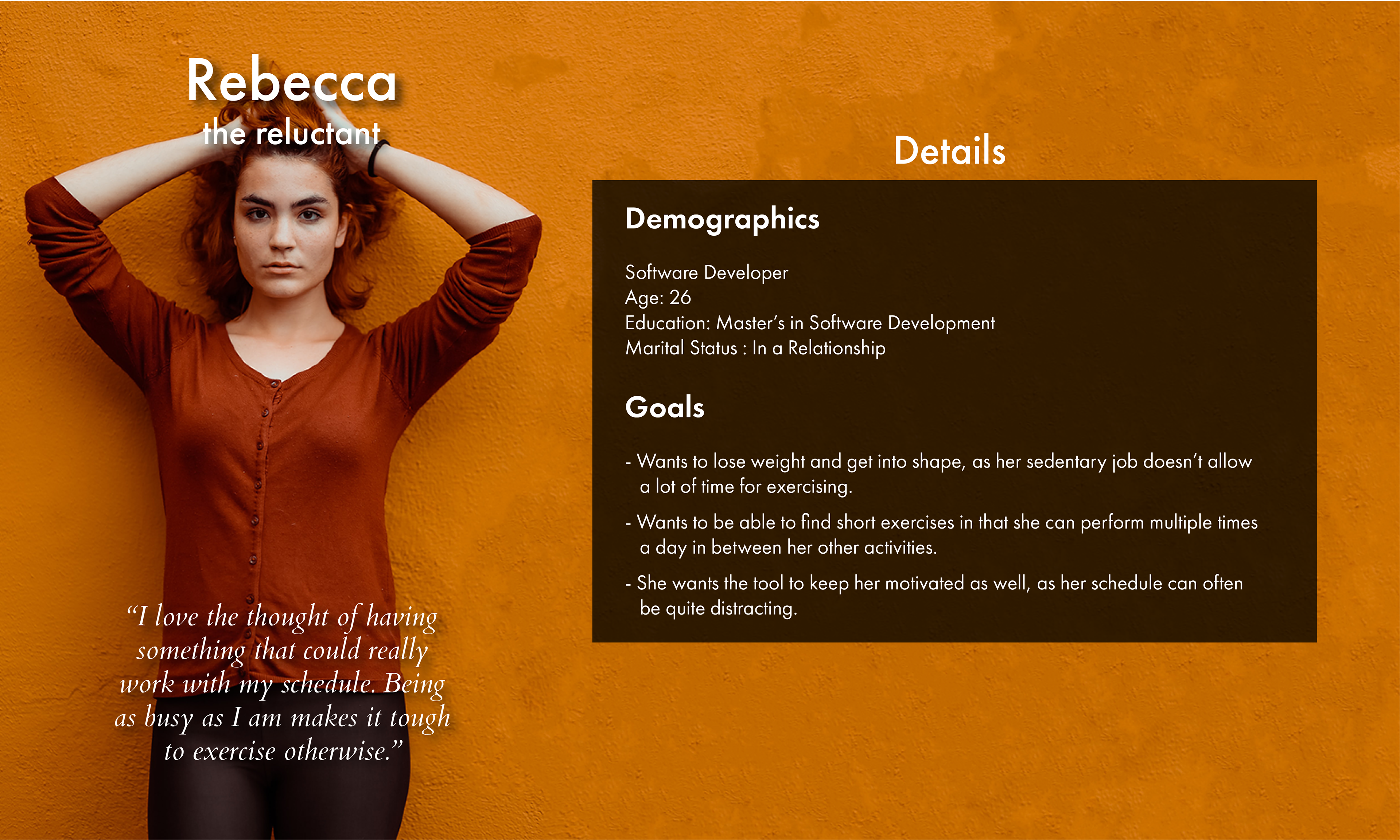
Sorting User Persona Information
We were given a persona to design for along with the user stories to match the persona. I would normally try to have multiple different types of users impact the design decisions I make and absolutely do as much user research as possible if time and budget allowed.
The persona I created on the right is dated and I focused on how to make it look decent. As a designer now, I would make sure that hard user information is the most prominent feature in any persona documentation.
Is Stealing Design Ideas Stealing?
Using Popular Platforms to Inform Decisions
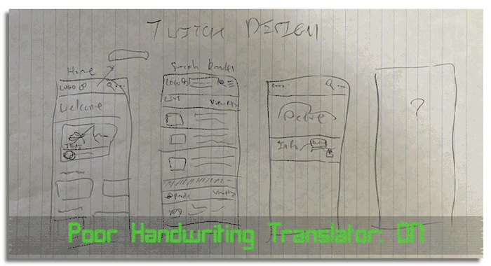
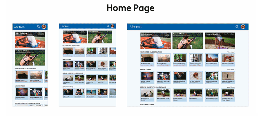
I decided on starting off with the mobile-first approach because the design would translate up easier and sketched out the general interfaces.
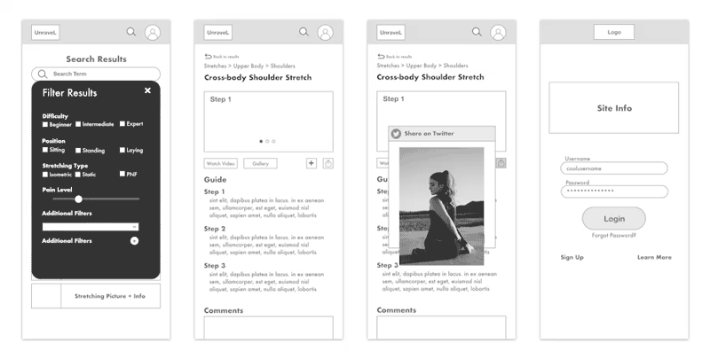
I looked at popular apps (Twitch, Yelp, Bodybuilding.com & more) to find appealing layouts suited to this app and found that cards to display information and a robust filtering system was the best solution for the use case of finding individual stretches.
Groups and Labels Galore
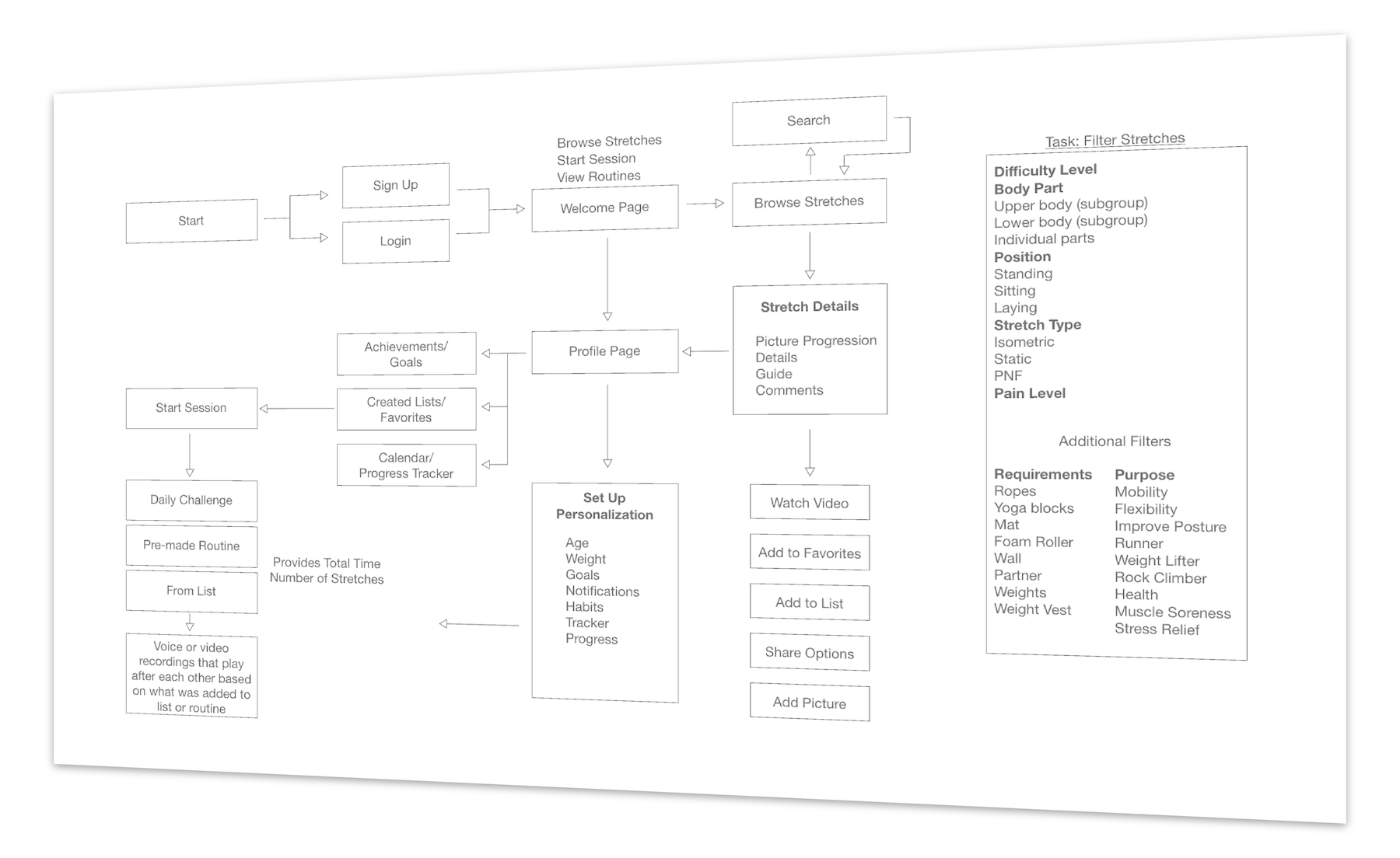
Finding an Organization Solution
With so many different stretches and body parts available, easily sorting through a collection was important. I decided that adding tags was a solution that was familiar to most users and would be helpful in organizing.
The tagging system would also be applied to various types of content such as individual stretches, routines, articles, or other information making it layered in its original use.
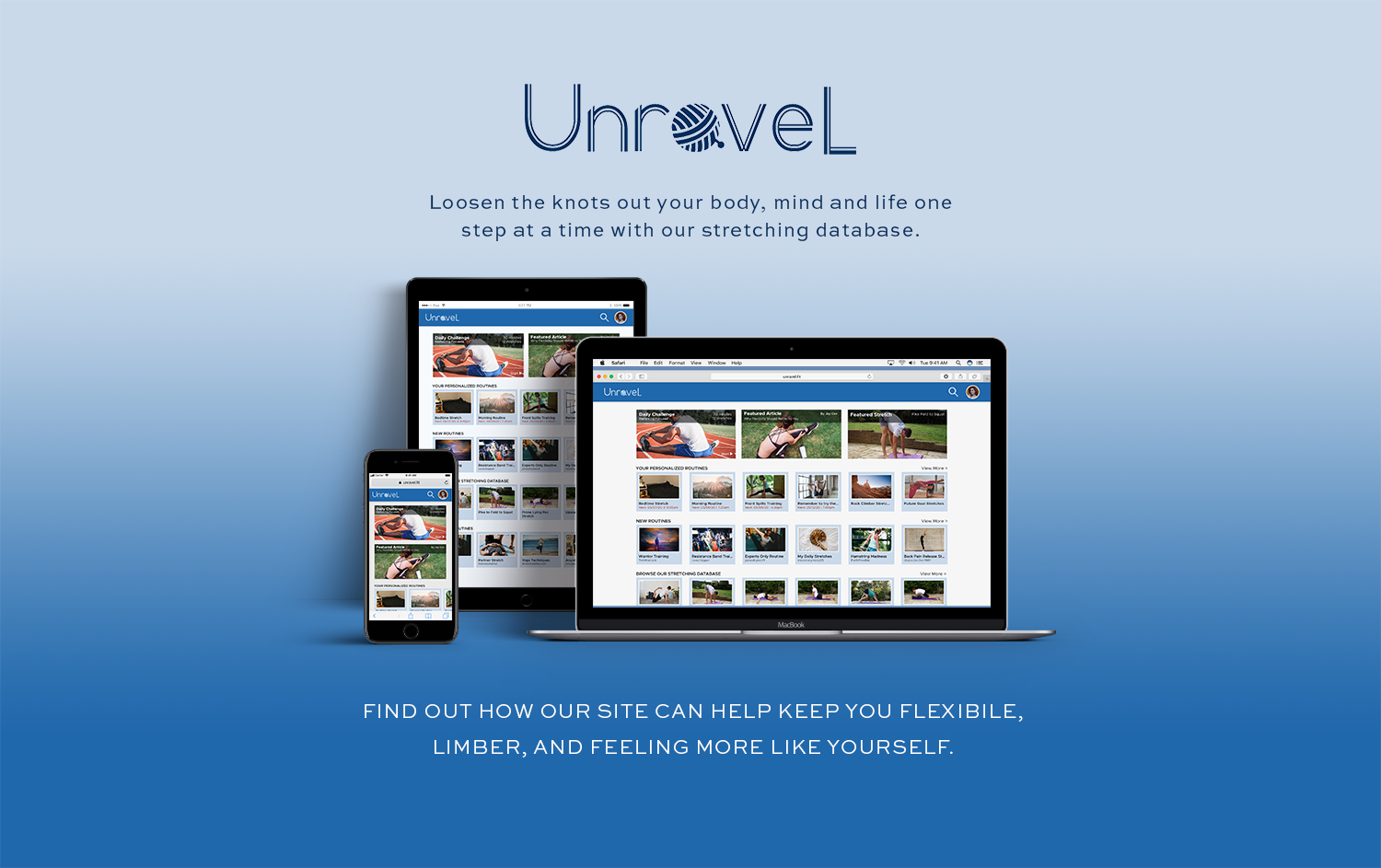
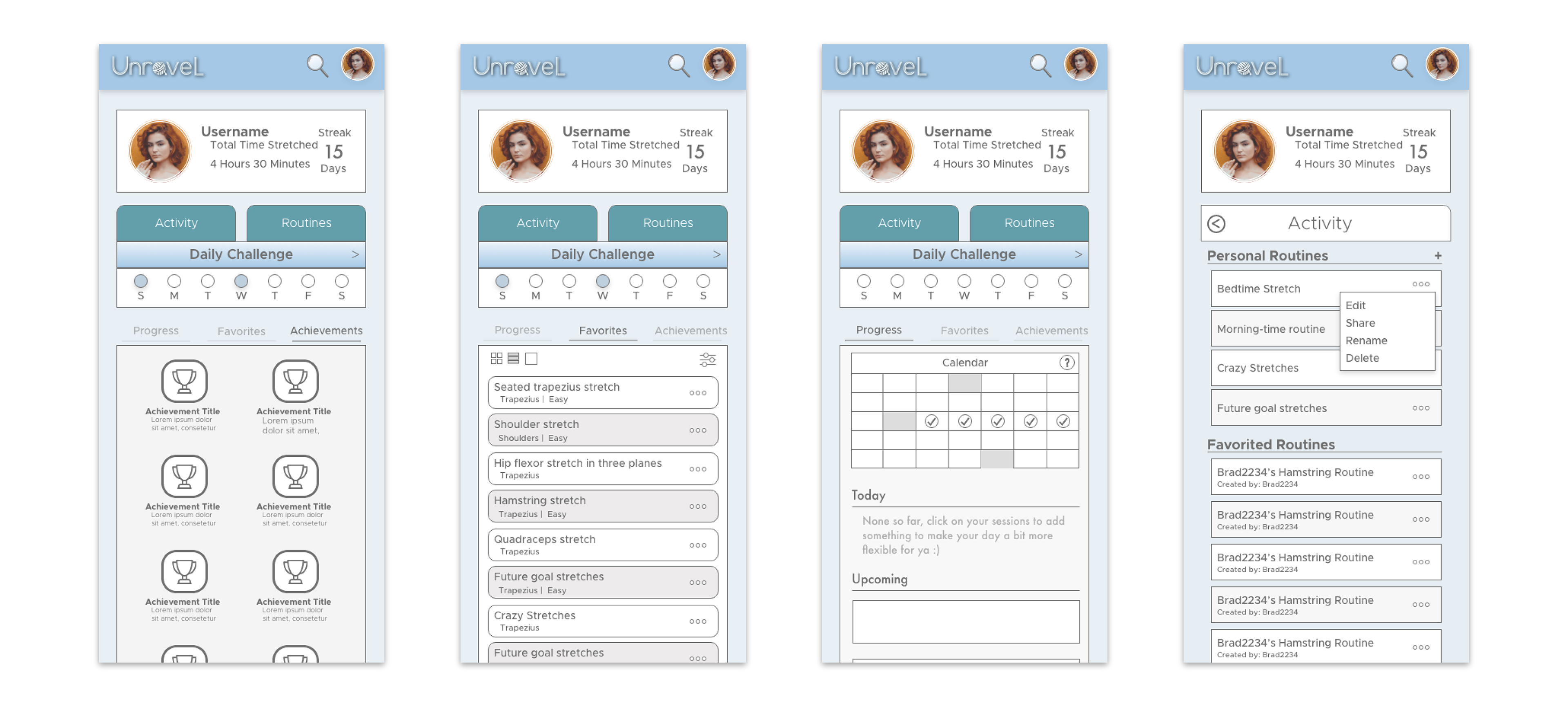
S O L U T I O N S
The Basic Building Blocks
Guides, Achievements, Daily Challenges & More
The basic requirements for the fitness app were to have the features I listed in the sub-title above. There were countless ways to approach these features depending on how the app was used.
To get a general idea of how to start, I began from the user profile to make sure these features were applicable to the user's needs. Having all the features tied to the profile could let me branch out from there to get a feel of how a stretching enthusiast would go about the app.
How I Bit Off More Than I Can Chew
Instructional Guides and Search Functionality
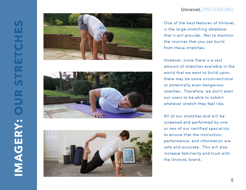
By having all sorts of guides and exercises, I wasn't sure how I was going to make the content accessible for all my users. Would they be able to submit their own stretches? How would this user-added content be displayed and shown in their search results?
I knew for sure that users could compile their own routines, but would be allowing users to add their own exercises of lower quality? Seeing as I wanted to ensure standards for UnraveL guides, I was concerned that uploaded content would hurt the quality.
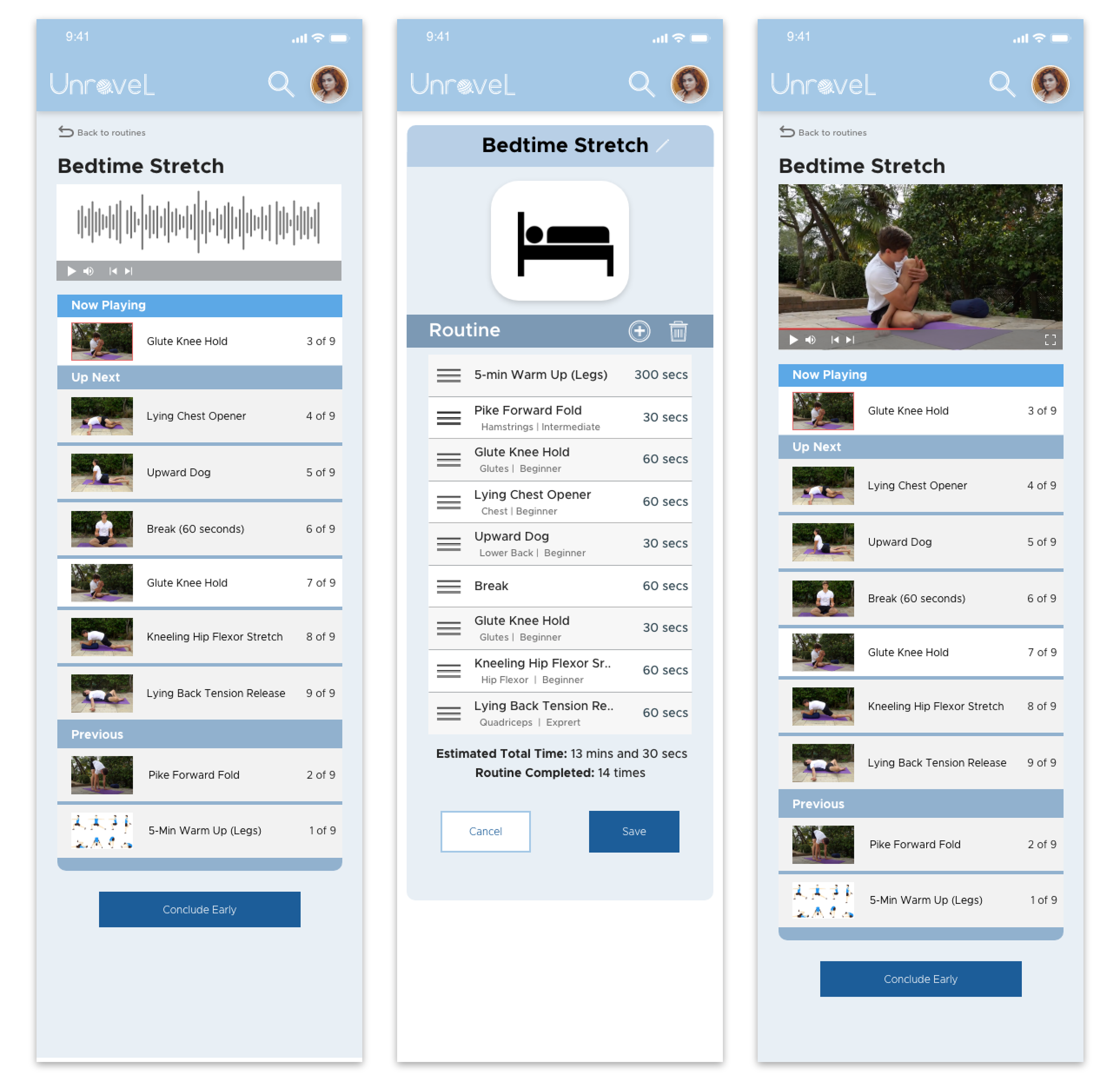
Look At Me, I'm the Instructor Now
Branding The App With A Friendly Face (and Voice)
I originally did want to allow user-created stretches and more. However, decided otherwise because it would be an extremely difficult undertaking to provide a uniform and enjoyable experience without controlling the content.
I concluded that a constant throughout the app had to be that all the exercises be taught, guided, and voiced by the same instructor to maintain consistency in both visuals and experience.
My Killer (and Unnecessary) Feature
Giving Users The Ability to Create Their Own Routine
I wanted users to be able to search for stretches they enjoyed and then be able to add them to a playlist-type scenario. Surely, there was a way I could do all this with ease* while making sure all other components supported this feature.
Similar to making your own guided stretching routine that you would find in a yoga class - but could be saved and shared digitally. It was important to me that users could find a routine that was exactly right for their goals.
*See Lessons Learned in Relections section below.
P R O T O T Y P E
"No Hard Feelings, Point Break"
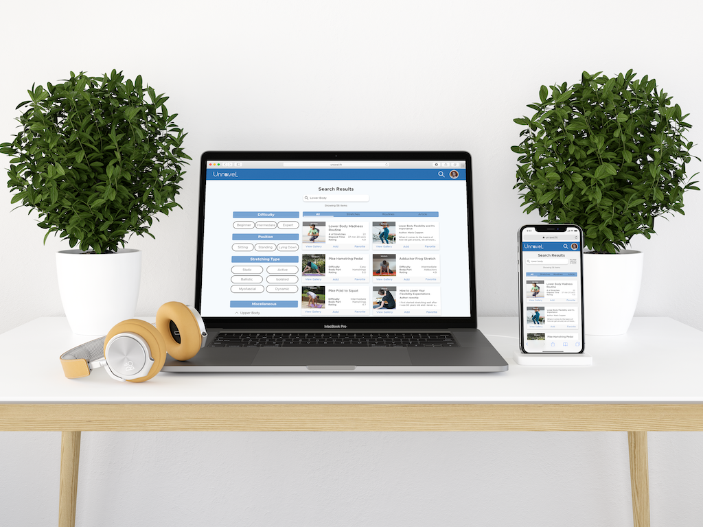
Breakpointing it Down on Mobile, Tablet & Desktop
There was also the matter of making sure this all made sense with the different platforms. Would every feature I wanted translate well to each type of device? There were a lot of options to make things work based on how I saw some companies handle their own applications.
I now know a little better and would just adopt a framework like BootStrap or Foundation to get the pieces in place. However, at the time, I designed it in a way that I thought would make sense taking cues from what was usable.
Where's Brita When You Need Them
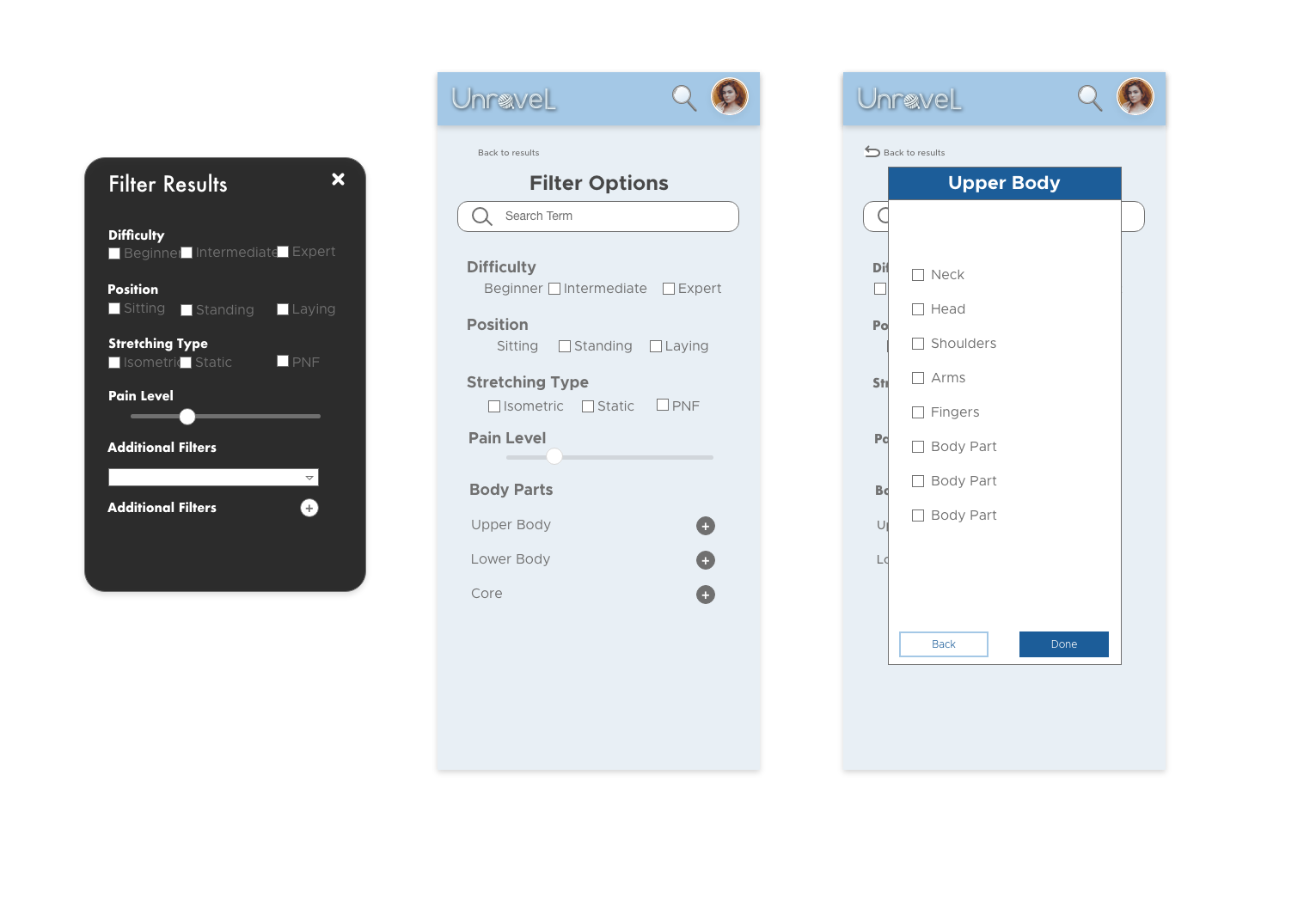
Creating a Filtering System For The Data
The part that felt difficult to prototype due to lack of user research and general testing was the filtering system for the stretching database. What was the best system for helping users search for exercises or stretches?
Seeing as I wanted to give options for users of all types, I found it hard to create a manageable search feature. While I wanted to introduce filter options like "pain level", the objective differences between all the stretches made it extremely difficult and required more research.
Do I Look Pretty in This Design?
Becoming Less About UX and More UI
So I think I should mention that this app was mainly focused on the purpose of learning user interface design. I had to face the facts - all the ideas I WANTED to do were just going to hold me back from finishing this project.
Eventually, the conclusion was that I just didn't have enough knowledge and resources to execute a proper prototype that would be functional in a respectable way. I wanted to create this app to as close completion as possible but it wasn't feasible for me at the time.
T E S T I N G
Me Do Bad UX Design Practices
Barely Doing Any Usability Testing
As mentioned above, this project was specifically for my UI Design Certification and didn't require any user testing. Believe me when I say that the more user testing that I could've done, would've saved me a lot of time in deciding on features of what worked and didn't. Instead, I constantly went over concepts in my head wondering if they work, not wanting to show my "ugly" designs at the time.
Presently, I would at the bare minimum, do user surveys or quick tests to get some feedback on my prototypes. I choose the lazy route back then and again now - in this particular instance - of not updating my website design process template. So I'm throwing in random stuff in this "Test" section, such as this animation showing my process from paper to hi-fidelity wireframes.
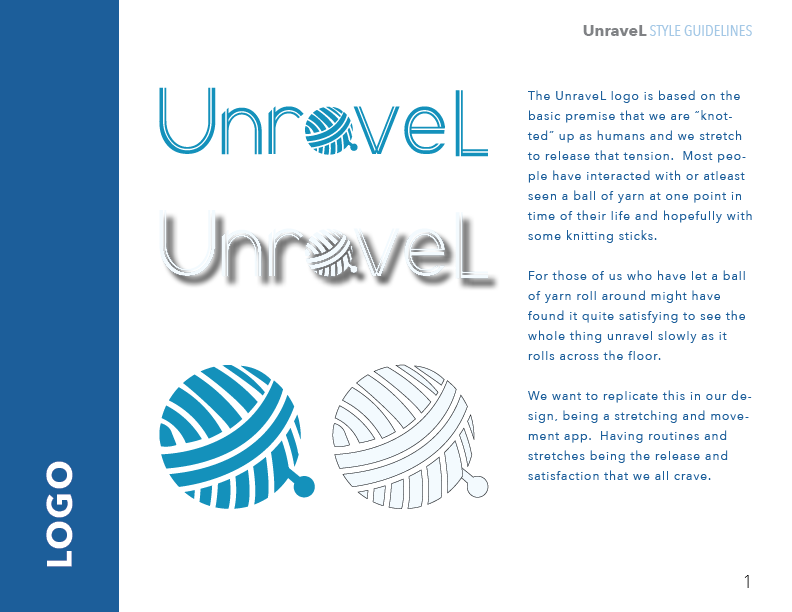
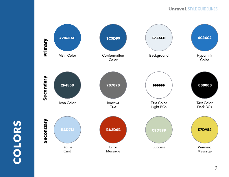
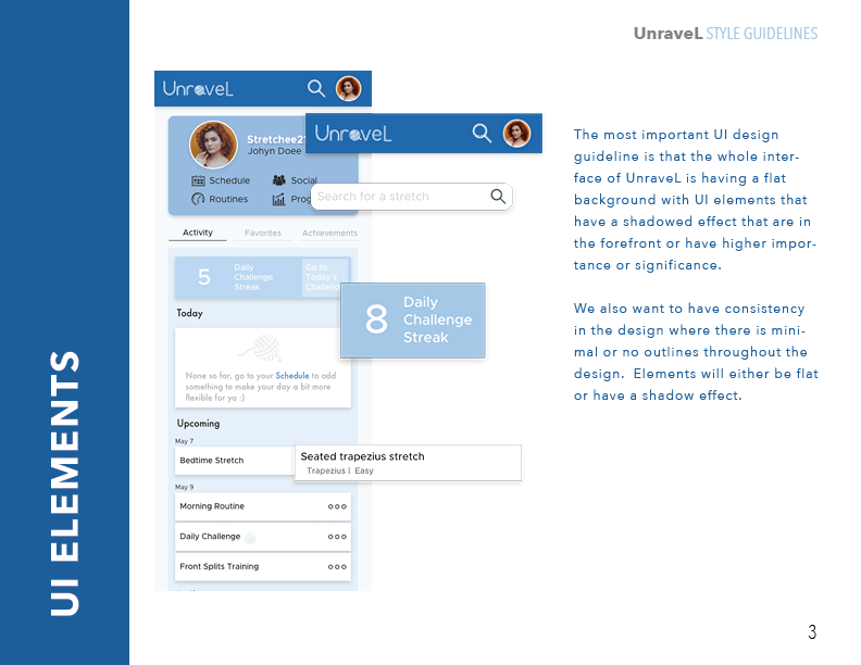
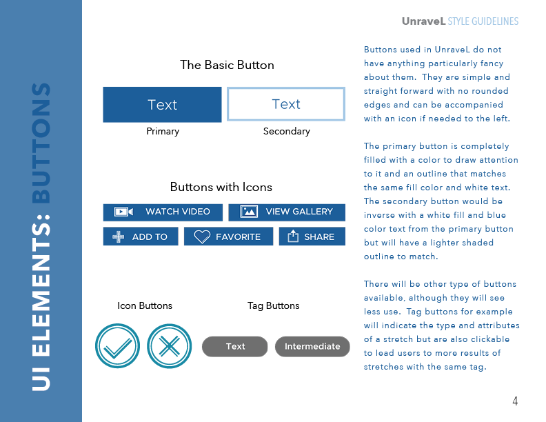
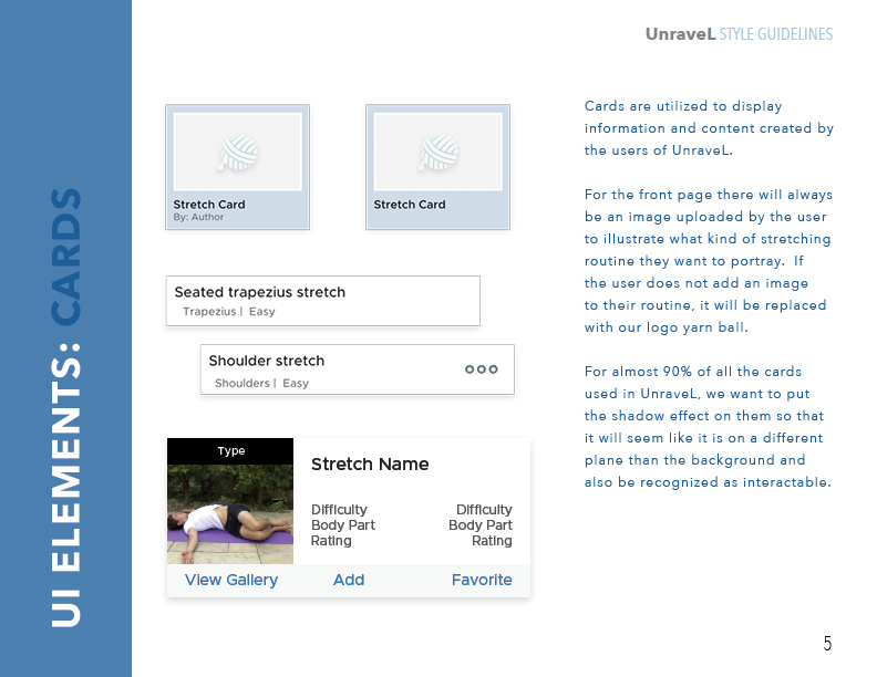
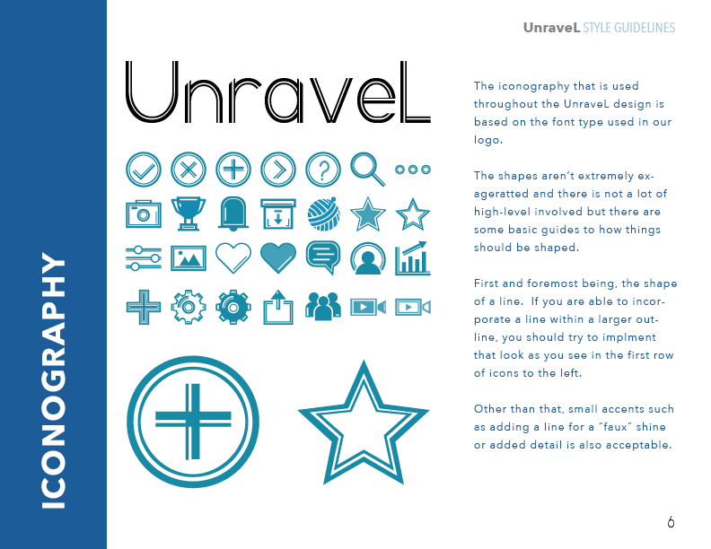
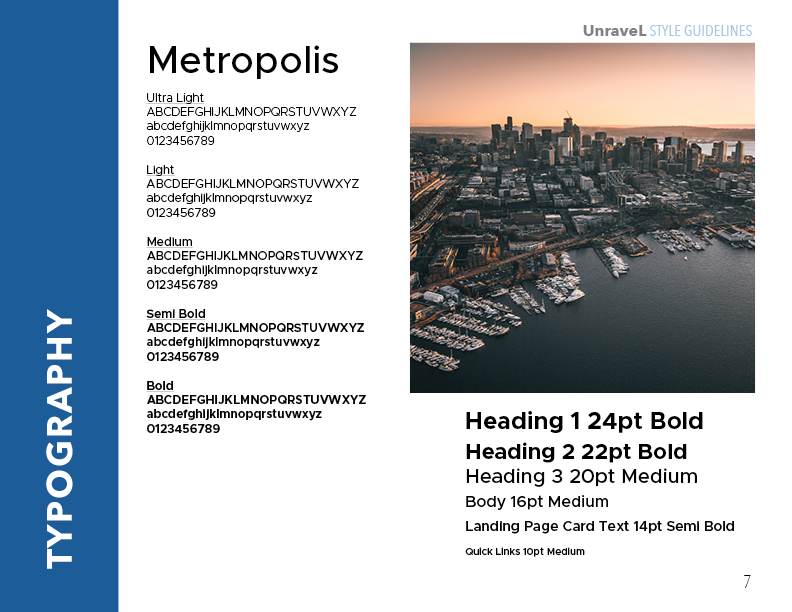
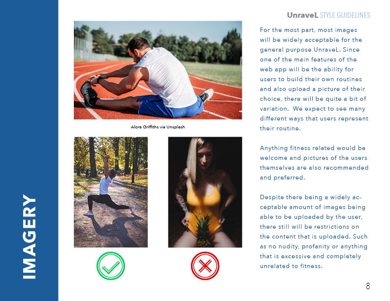
Style Guide Changes
Unraveling the Pattern Library
Since I don't have any testing to show here, I'll also put the style guide that I created for UnraveL. I'll admit I didn't have a complete grasp on how a style guide was used and just followed what content was in the project requirements.
I've now come to really appreciate pattern libraries and style guides and see the value they offer. Now I'm much more familiar with design knowledge and can generate the proper assets and information that's pertinent in establishing a brand.
R E F L E C T I O N S
Lessons Learned
Trying to Create a Bunch of Features is No Joke
On top of my other ideas - I even wanted to create social network capabilities to promote stretching accountability, share your progress and, see other statistics. A feature where you could toggle on the scientific names of muscle groups instead of more commonly known terms.
When you're trying to design something, there is just way too much to break down especially if you have to design a database that's reliant on filters and other features. From now on - get one feature going at a time and always find the critical path to an MVP (minimum viable product).
New Revelations
Being Amazed at How Vector Art Worked
This project at the time really gave me a headache because I was (and still am) sipping on that big ole' cup of Impostor Syndrome. Nothing I made was good enough compared to others and I'm not happy with how some things turned out.
However, the process did help me to learn Adobe Illustrator and find how powerful the program is for graphic design and my affection for it all. Creating the logos and assets from scratch was definitely the highlight of the project.

Final Thoughts
The Importance of a Foundation For Everything
This entire project was something that taught me a lot about designing apps in general. How not having proper research and direction, will just have you running in circles. It taught me to plan things out in the simplest form and solidify the core concepts before you start tinkering around with minor details.
With more time and interest to invest, I believe this product could have been much better than it is currently. It was, however, an excellent practice project to truly understand the cyclical nature of iteration and design. I'm still happy in seeing my ideas brought to life (even if not that aesthetically pleasing) and will consider this one of the best learning experiences for my growth and future endeavors.
S P E C I A L T H A N K S
Photo Credits
Francis Gunn via Unsplash
Bruce Mars via Unsplash
Sergio Souza via Unsplash
Avi Richards via Unsplash
Indian Yogi via Unsplash
Tyler Nix via Unsplash
Dane Wetton via Unsplash
Kari Shea via Unsplash
Erin Wilson via Unsplash
Paul Hanaoka via Unsplash
Kike Vega via Unsplash
Francis Gunn via Unsplash
Patrick Hendry via Unsplash
Alora Griffiths via Unsplash
Annie Spratt via Unsplash
Christopher Campbell via Unsplash
Alex Block via Unsplash
Charlotte Karlsen via Unsplash
Calder B via Unsplash