

Client:
CareerFoundry
Duration:
5 months (07.2019)
Type:
Mobile iOS Application
My Role:
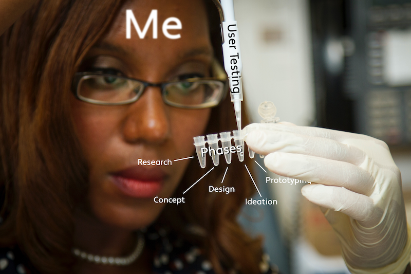
UX/UI Designer
Contributions:
Game Concepts
User Experience
User Interface
Brand and Pattern Library
T H E P R O J E C T
Create a scavenger hunt app that sets itself apart from what currently exists on mobile app stores. Find a way for scavenger hunt players and newcomers to pick up and enjoy the excitement of a typical scavenger hunt but with new and exciting additions as well.
Target User: Scavenger Hunt and Game Enthusiasts
Challenges
How to design for something unique and new with their friends and meeting new people while enjoying a scavenger hunt game?
Solutions
Have game customization and creation at the forefront with options that can satisfy all types of players. Multiple game modes can maintain interest through randomly generated objectives or gameplay.
How to make social decisions based on the experience gamers want to have?
Increase the competitive aspect by having location-based objective tracking to see where your opponents stand or are heading towards. A compelling point or reward system can also be used to increase social tension.
How can I make it conversational by thinking about how to bring the experience to life by increasing social interaction with other players during the use of the game?
Reinforce modern gameplay elements that are not a available to traditional scavenger hunts. Features such as a limited amount of traps to sabotage your opponent's goals can add a strategic element to determine who is the winner.
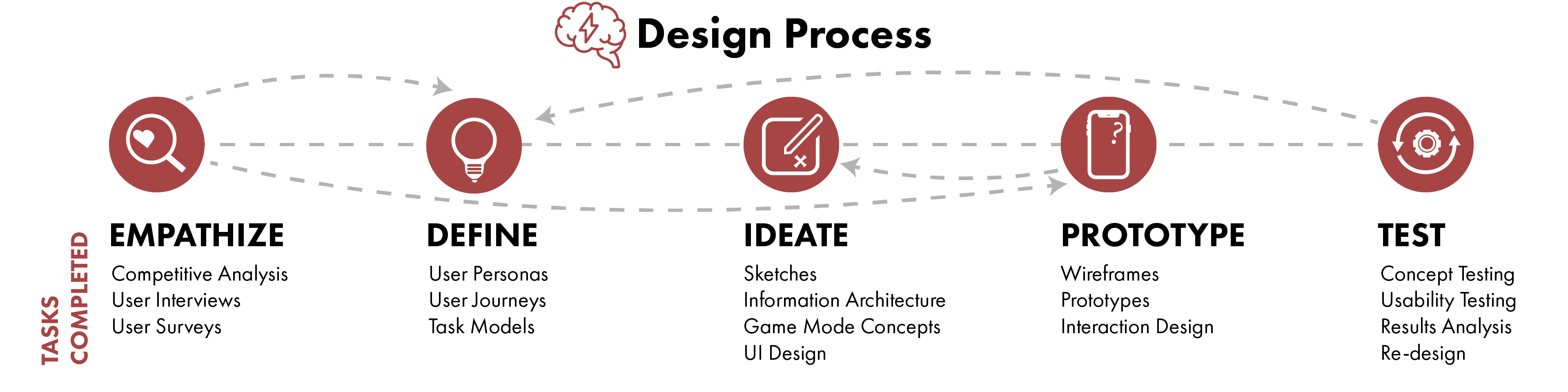
T H E P R O B L E M
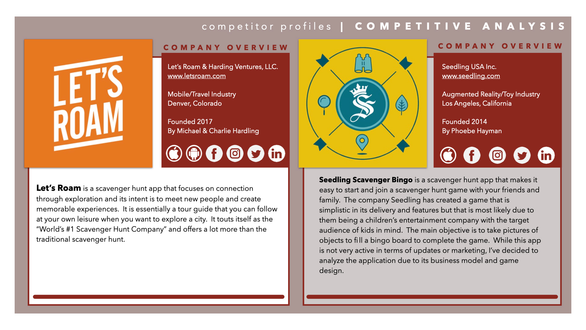
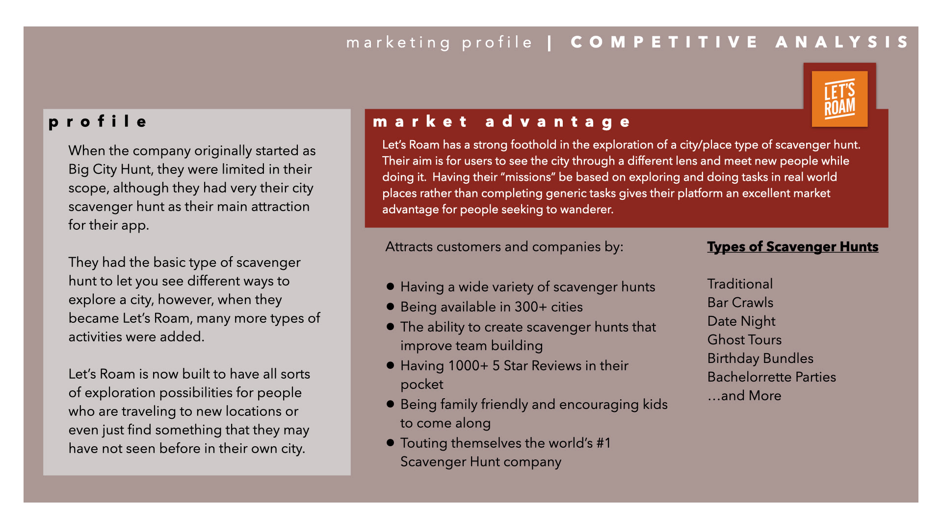
Spot Trends in Digital Scavenger Hunts
Studying Popular Apps with Competitive Analysis
Scavenger hunt app companies were selected based on popularity and researched further. Their products were assessed to determine any useful observations such as scavenger hunt game creation never being one of their primary features.
These apps were also either team-building or tourist oriented and what was gameplay-focused were aimed at children. All experiences were always a curated scavenger hunt experience with no customization options.

Find Opportunities in Potential Users
Gathering Expectations from User Interviews
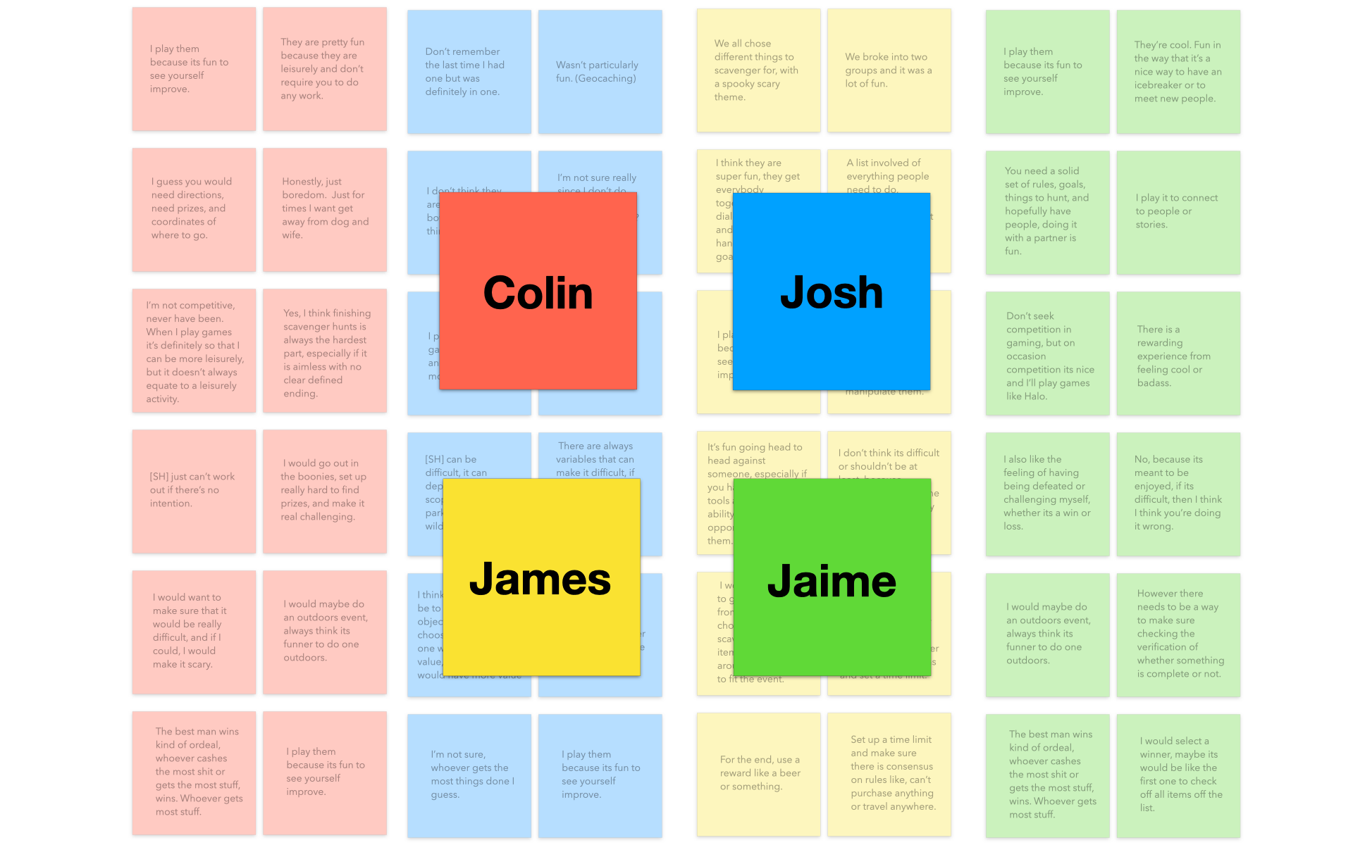
With preliminary research, interviews were started to confirm the findings and investigate more. Four interviewees were selected and an interview script was produced target their interests with concepts of substance were organized by affinity mapping.
Unfortunately, most participants didn't have any strong feelings towards scavenger hunts due to it being novelty at best. However, there was a lot of benefit in learning what they considered to be challenging or fun in gaming, which can be useful in translating those to similar features in the app.
Insight #1
Different Strokes for Different Folks
Users want an experience that is easy to pick up but not everyone wants to have the same game variables, such as rewards and time limit. Some people might even want different rule sets.
Result: Focus on making scavenger hunt game creation with strong customization options.
Insight #2
Social Aspect Is Important for Fun
It can be advantageous using a smartphone over a typical pen-and-paper in a scavenger hunt. Being able to talk during and after a scavenger hunt is one the most enjoyable parts of a real scavenger hunt.
Result: Implement a communication system that enables friendly banter and coordination for competition. Add a layer of complexity with sabotage-like game elements.
Insight #3
Variety is Needed As Incentive
Scavenger hunts are inherently not very exciting and are typically only played on special occasions. If users want to keep coming back, there needs to be some sort of replayability or reward system.
Result: Adding multiple game modes that highlight randomization as a key element can keep the game from going stales.
R E S E A R C H
Ensure Understanding is Frictionless
Dictating Interaction Design from User Research
Traditional scavenger hunts are pretty straightforward and ideally should be true for its digital counterpart. How a game should be created or played should be easy to pick up and navigation should be familiar to other apps.
Once working prototypes were completed, I validated the designs with on usability testing and user research. The goals were to ensure that all flows were streamlined and accessible when immediately when encountered.
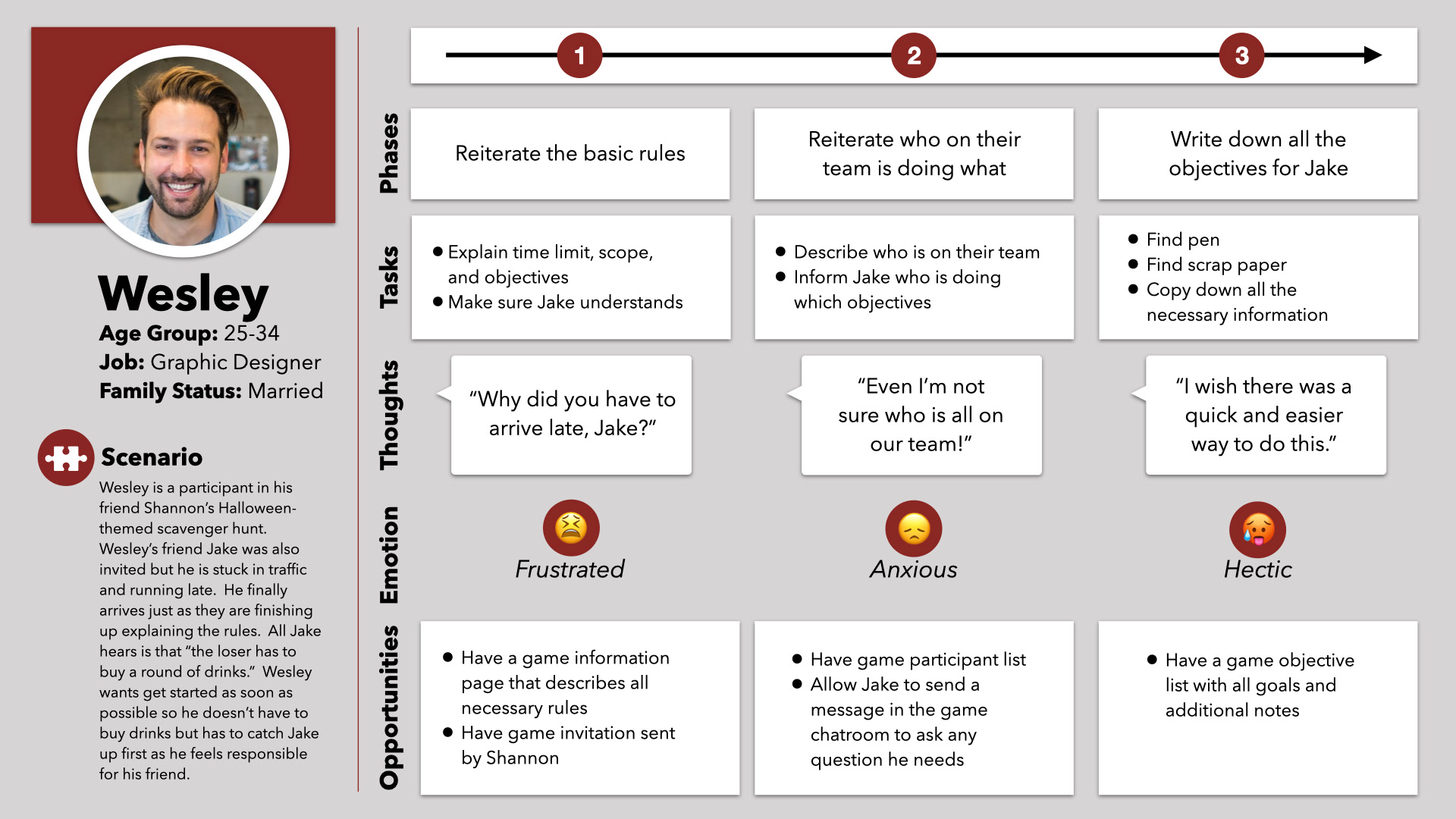
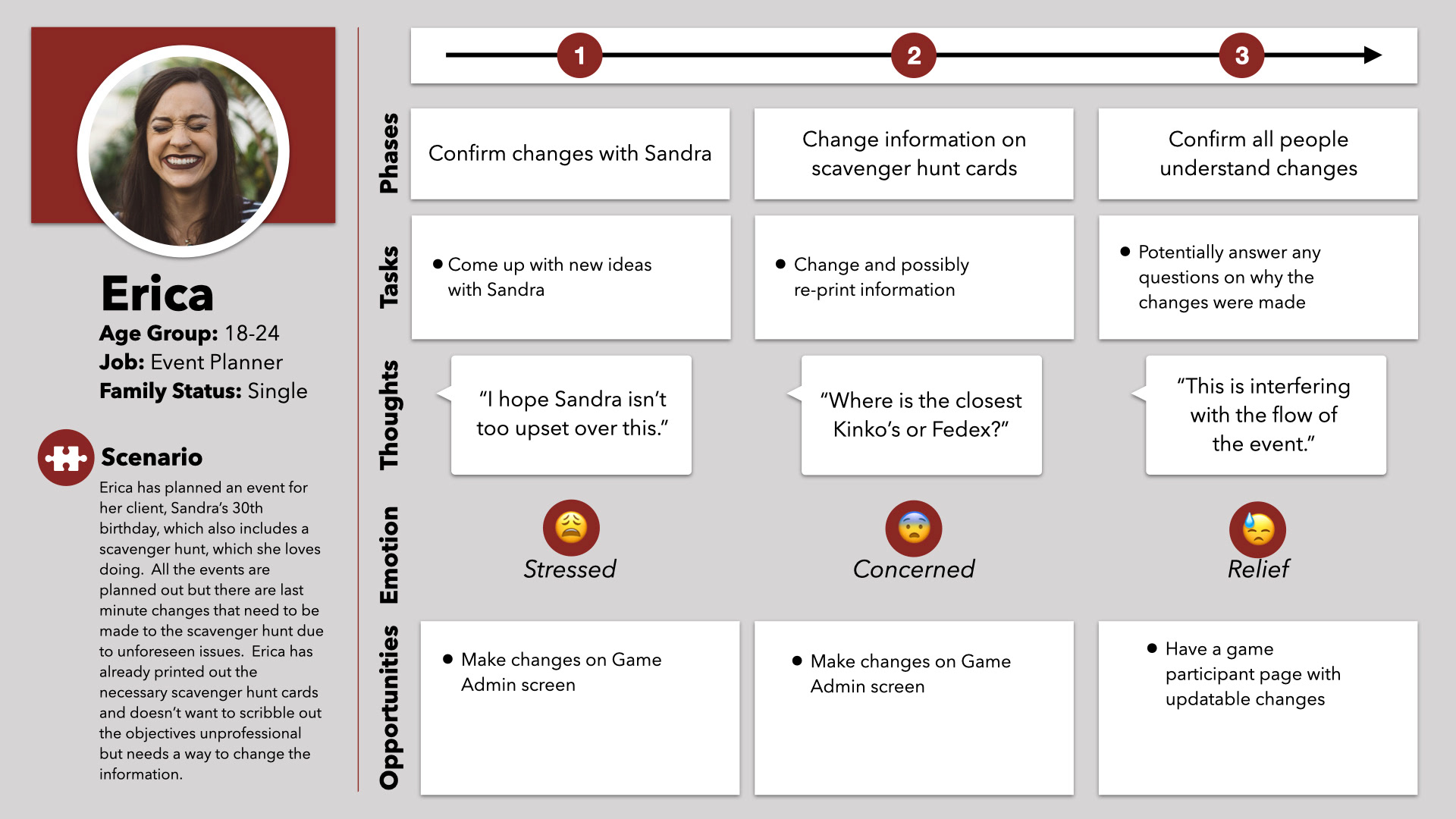
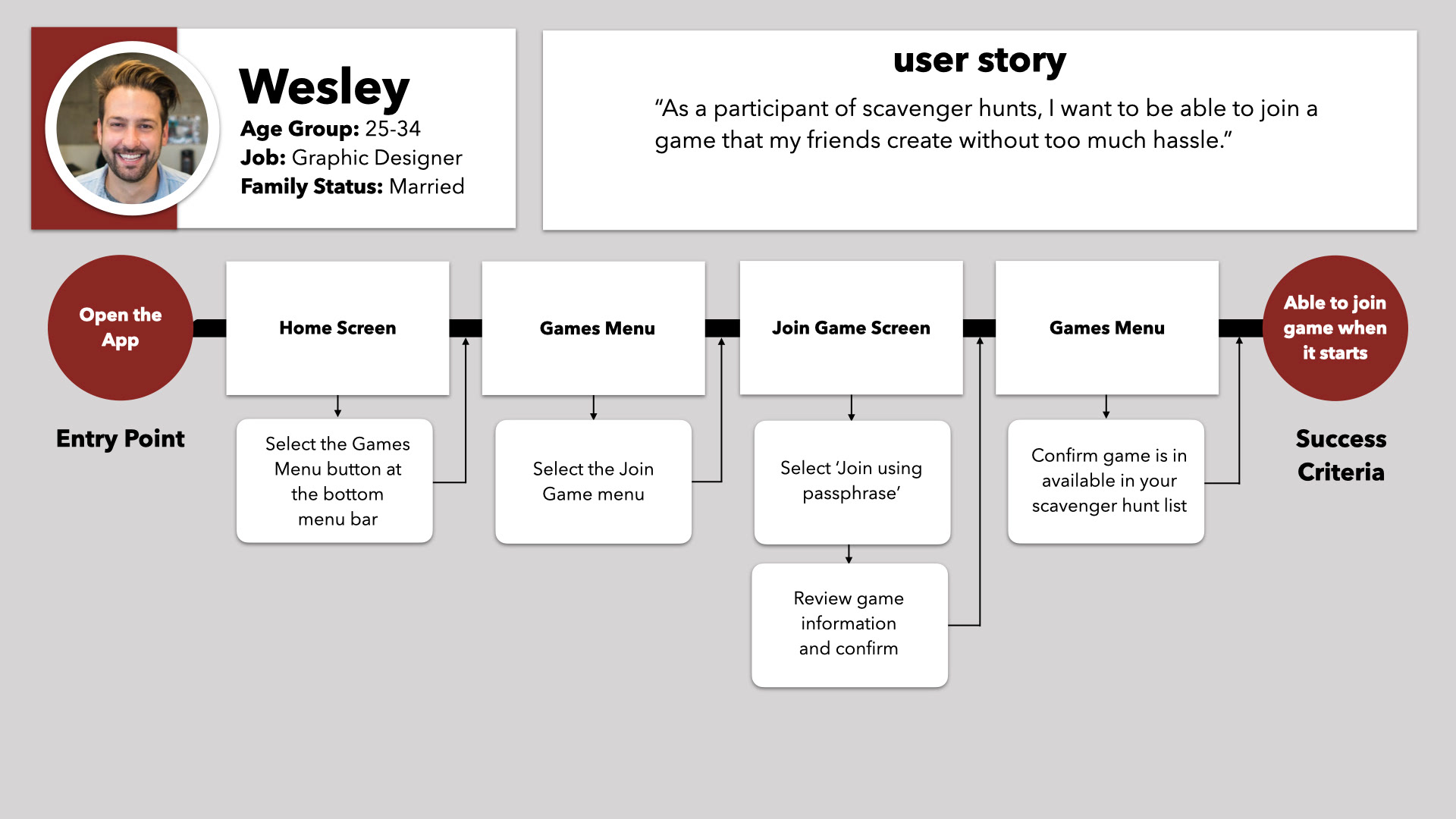
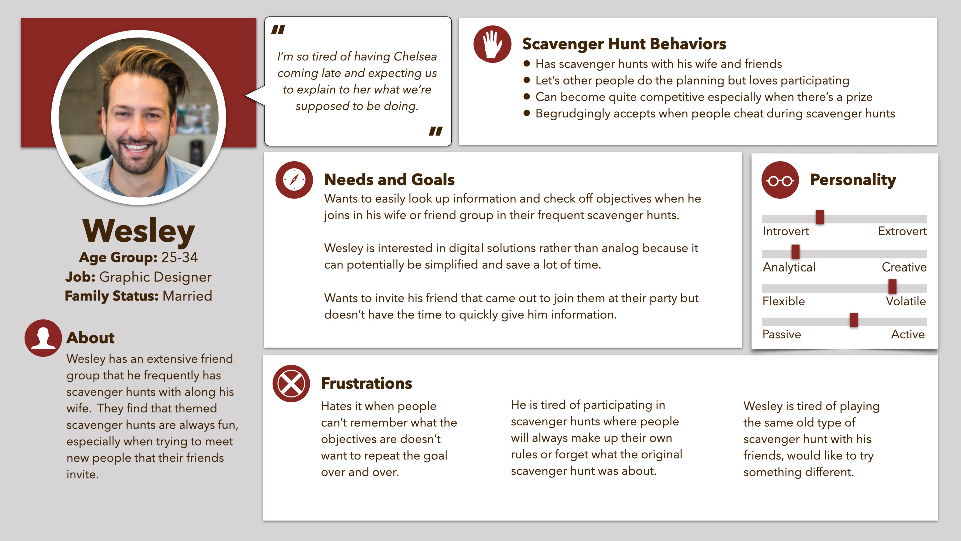
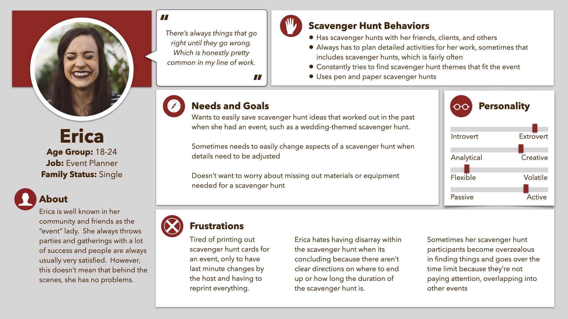
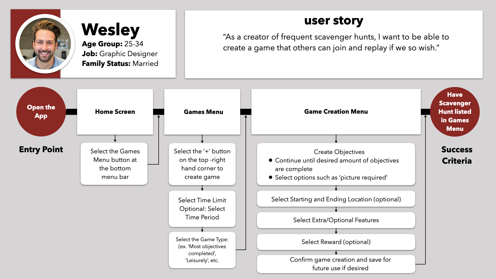
Walk in the Shoes of Others
Mapping Flows and Stories of User Personas
User personas were made with typical scavenger hunt traits helped illuminate some missing considerations. If there were scavenger hunt enthusiasts, they might be interested in having game templates to play or re-use when desired.
Task flows were also great in finding game elements that should be customizable in the app. These potential rules and time limits can all be listed in the app so that there is no confusion or cheating involved.
Have Logical Information Architecture
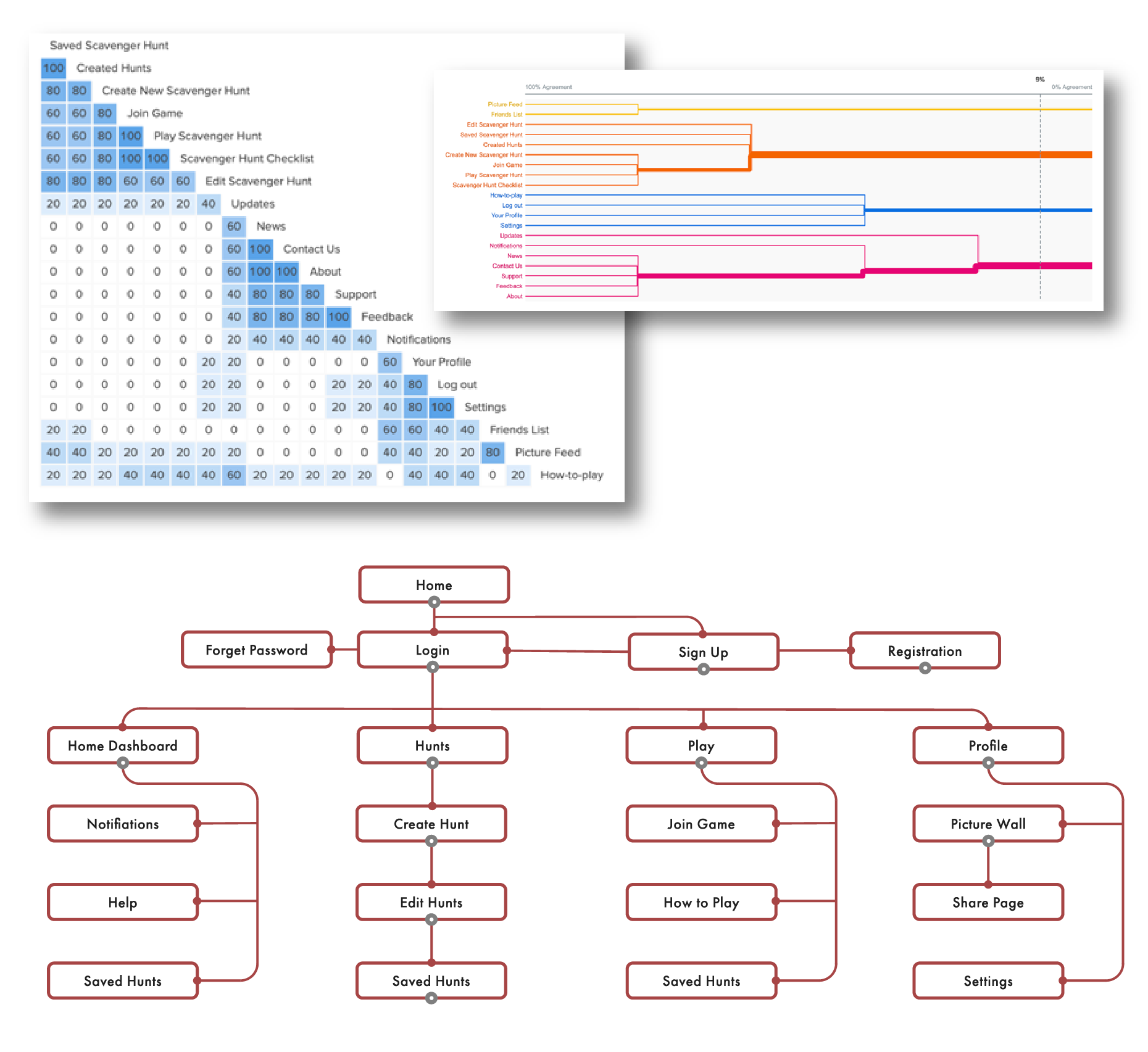
Looking for Patterns in Card Sorting
There was a lot of personal uncertainty in what would be the best form of creating the layout of the app seeing as there were no similar apps to learn from. I felt the best way to define the information architecture was to get advice from the potential users of Wayward Hunt.
Four participants were asked to organize their thoughts on where certain features and pages would ideally be categorized in a menu using card sorting via Optimalhub.com. There was some consensus in the quantitative data but as the survey pool was only four users, there was not enough information to accurately confirm certain groupings.
Consider the Best Onboarding Process
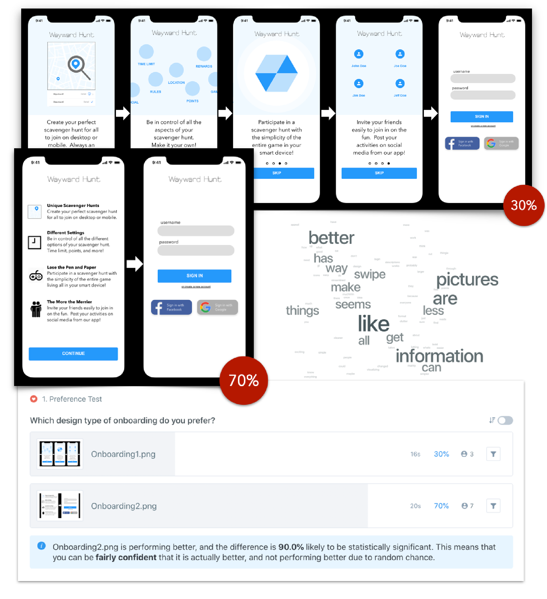
Finding Balance A/B Preference Testing
As most users wouldn't be familiar with using a scavenger hunt creation, there needed to be a simple way to teach users how to do so. A/B preference testing via Usabilityhub.com was used to find the favored method that players would want to learn how to use the features. A few delivery methods for onboarding content were presented to users.
It seemed that a 70% majority wanted a deeper learning experience to be not part of the onboarding experience in a separate module. Notes were that users thought that having an extensive registration experience due to additional learning may be undesirable.
D E S I G N
S O L U T I O N S
T E S T I N G
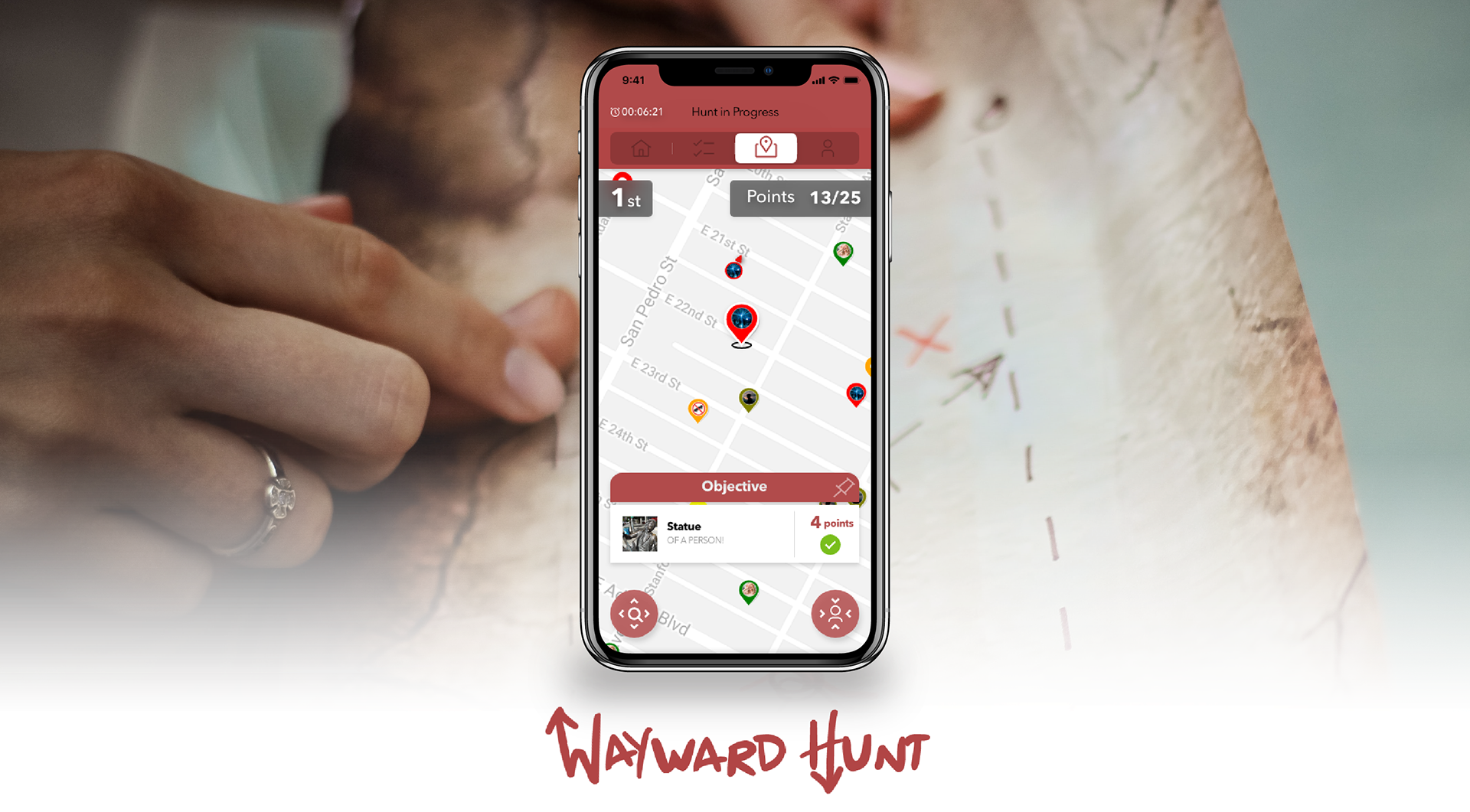
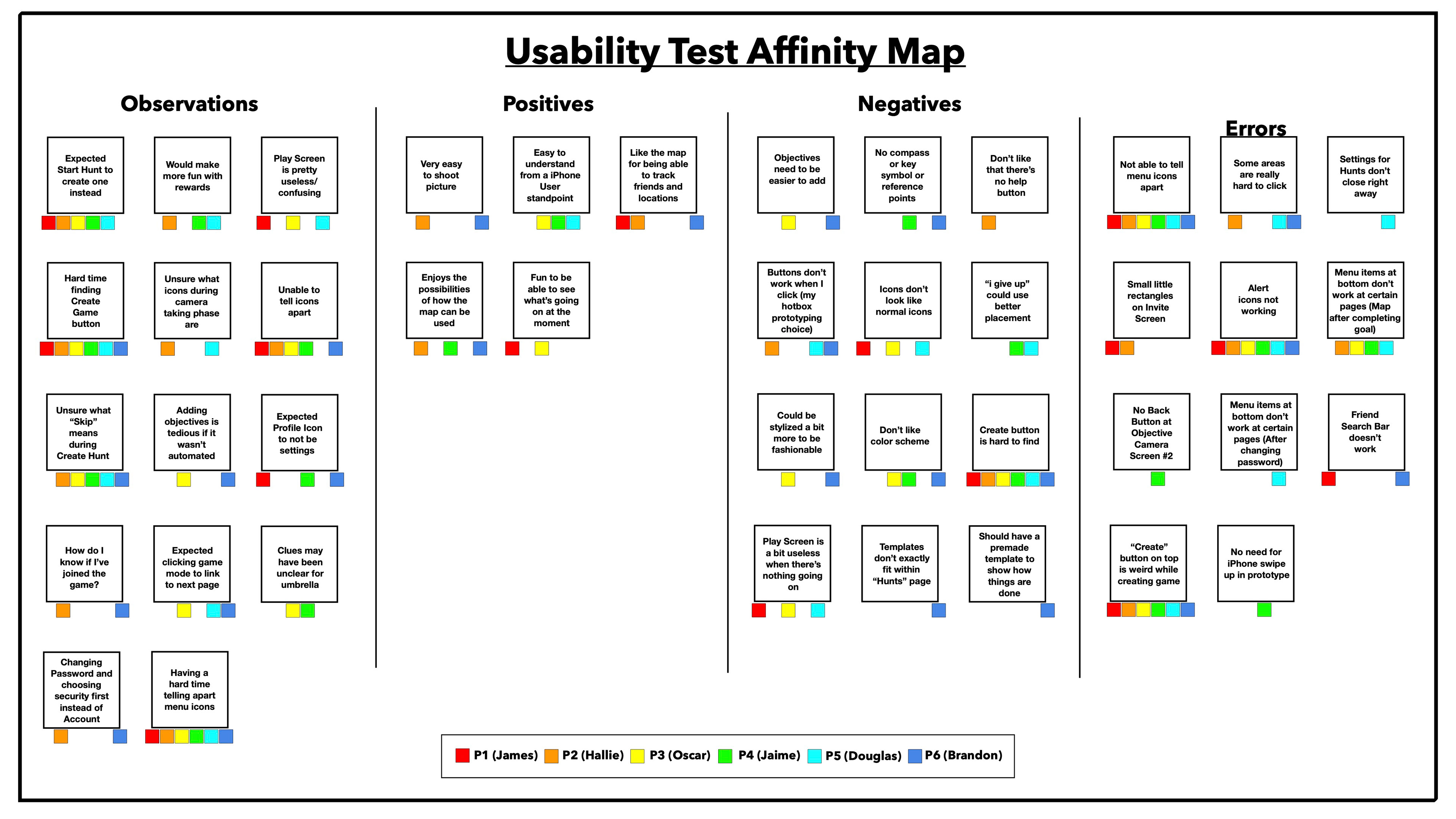
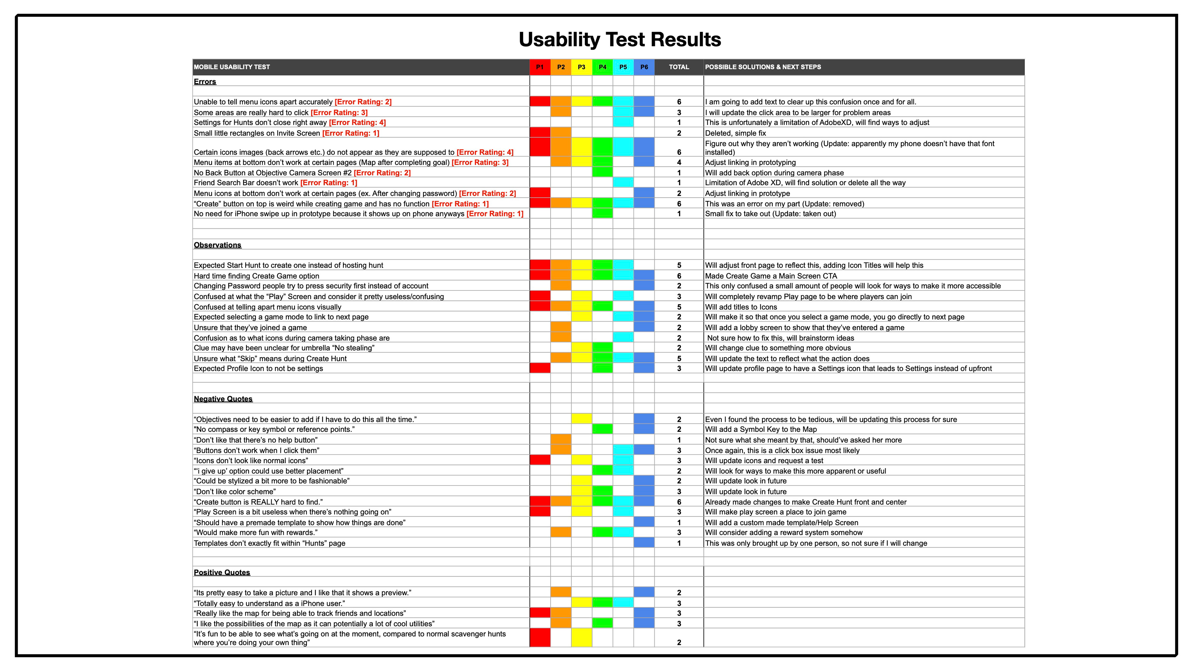
Produce an Accessible Game Experience
Determining Player Flow with Usability Testing
Prototype testing was done in-person for 5 out of 6 users with one being remotely completed. All testing was executed to the guidelines of my usability test plan and script. An iPhone X was used and audio was recorded to review feedback given during the session.
Afterwards, responses and feedback were organized using an affinity map again and entered into a rainbow spreadsheet to identify and fix common defects or misunderstandings.
"It's fun to be able to see what's going on at the moment, compared to normal scavenger hunts - where you are doing your own thing and don't have a clue what everyone else is up to."
- Doug
Test Configurations:
Mid-Fidelity Prototype
Adobe XD
iPhone 10
Usability Test Tasks Given:
Create a Scavenger Hunt game
Invite a Friend to a Scavenger Hunt
Complete the "Find an Umbrella" objective
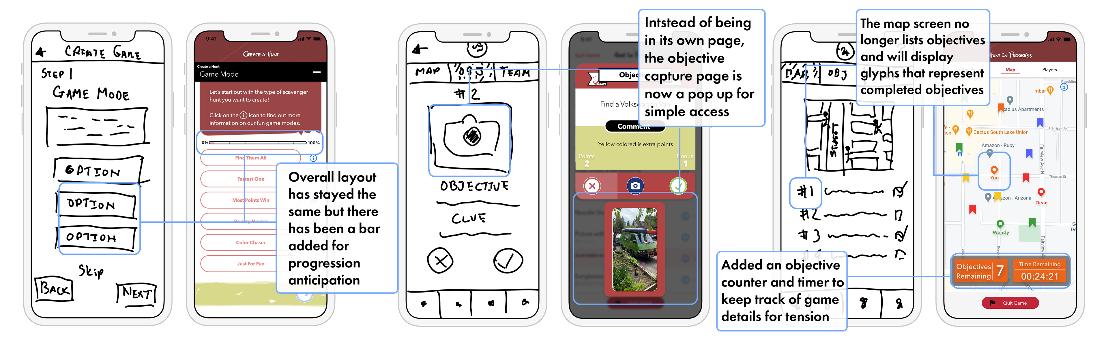
Resulting Call-to-Action Changes
Adding to the Home Screen
Added a 'Create Game' button on the home screen as the previous method was "hidden" for users and is important aspect of the product. It was originally on the top-right corner of a separate page labelled 'Create' and was not immediately understood what it would create.
This brought upon changes to the location of where available, previous, and saved scavenger hunts were located and the way users could find games.
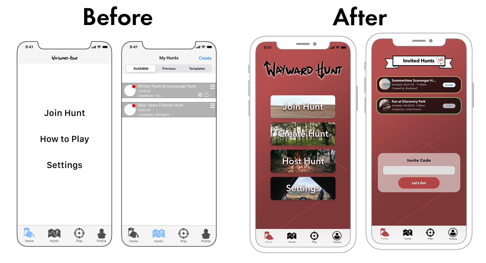
Resulting Look and Feel Changes
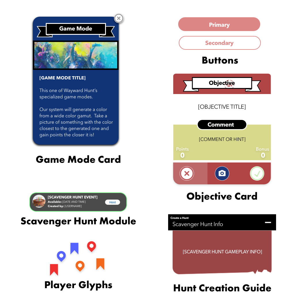
Solidifying the Pattern Library
It was clear that some icons and gameplay elements were not universally recognized, there were some definite steps to move all assets to common designs. Glyphs such as location pins and bookmarks were implemented.
Cards were also created for specific instances to classify events or present information. Modal windows were also implemented during game creation to optimize solutions for optional game elements. Everything was then organized and curated in a pattern library for future use.
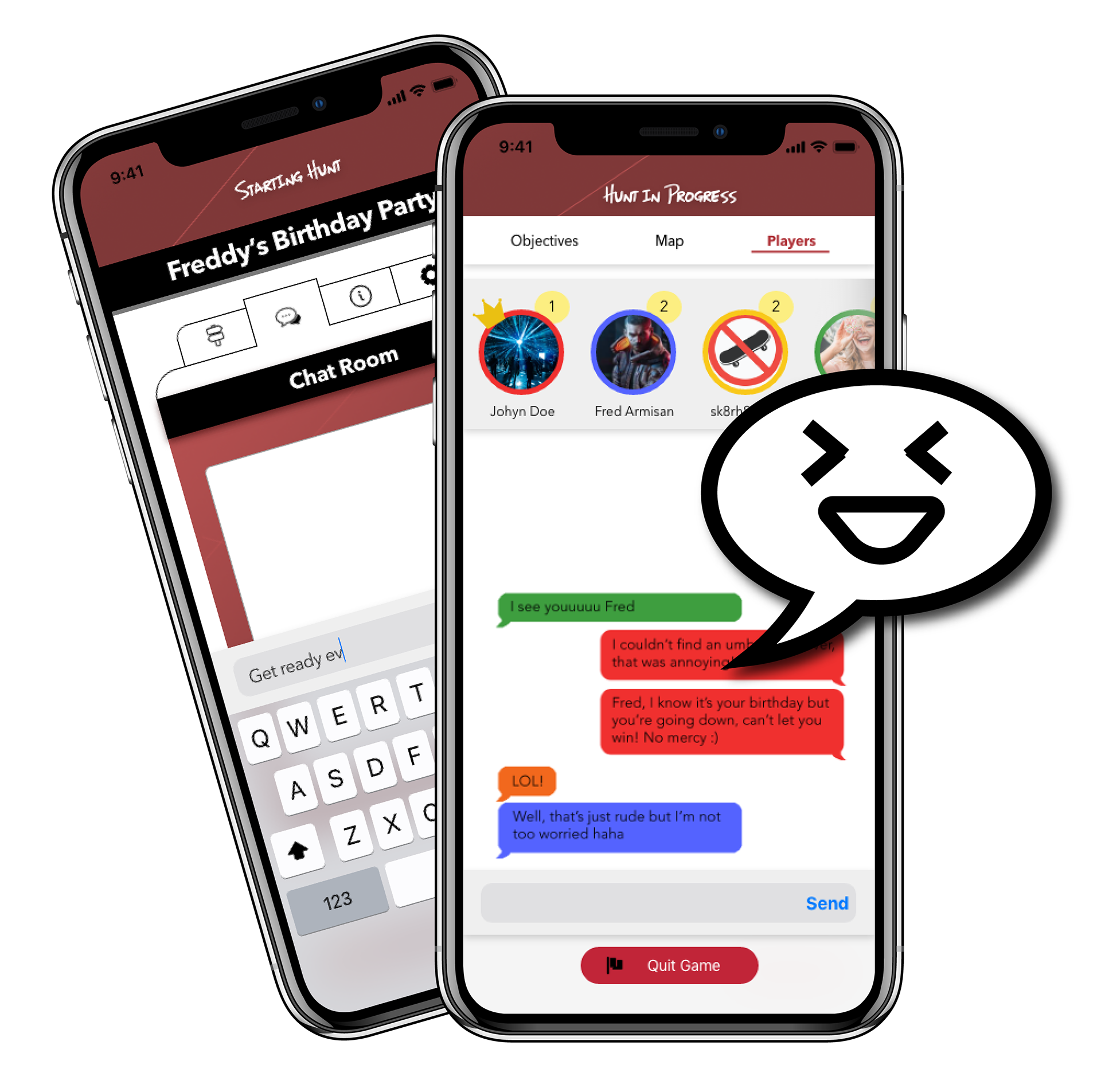
Resulting Gameplay Changes
Socializing Between Players
There were some private messaging options to help the social aspect of Wayward Hunt - however, they proved to be not that useful. You only really needed to talk to someone after they had been invited to or participating in a game.
Private messaging was not necessary as users could use their phone to contact their friends to come join and play. Chat rooms were implemented to be a part of every hunt that was created to maintain fun social elements.
R E F L E C T I O N S
Game Modes of Design Past
Biting Off More Than I Can Prototype
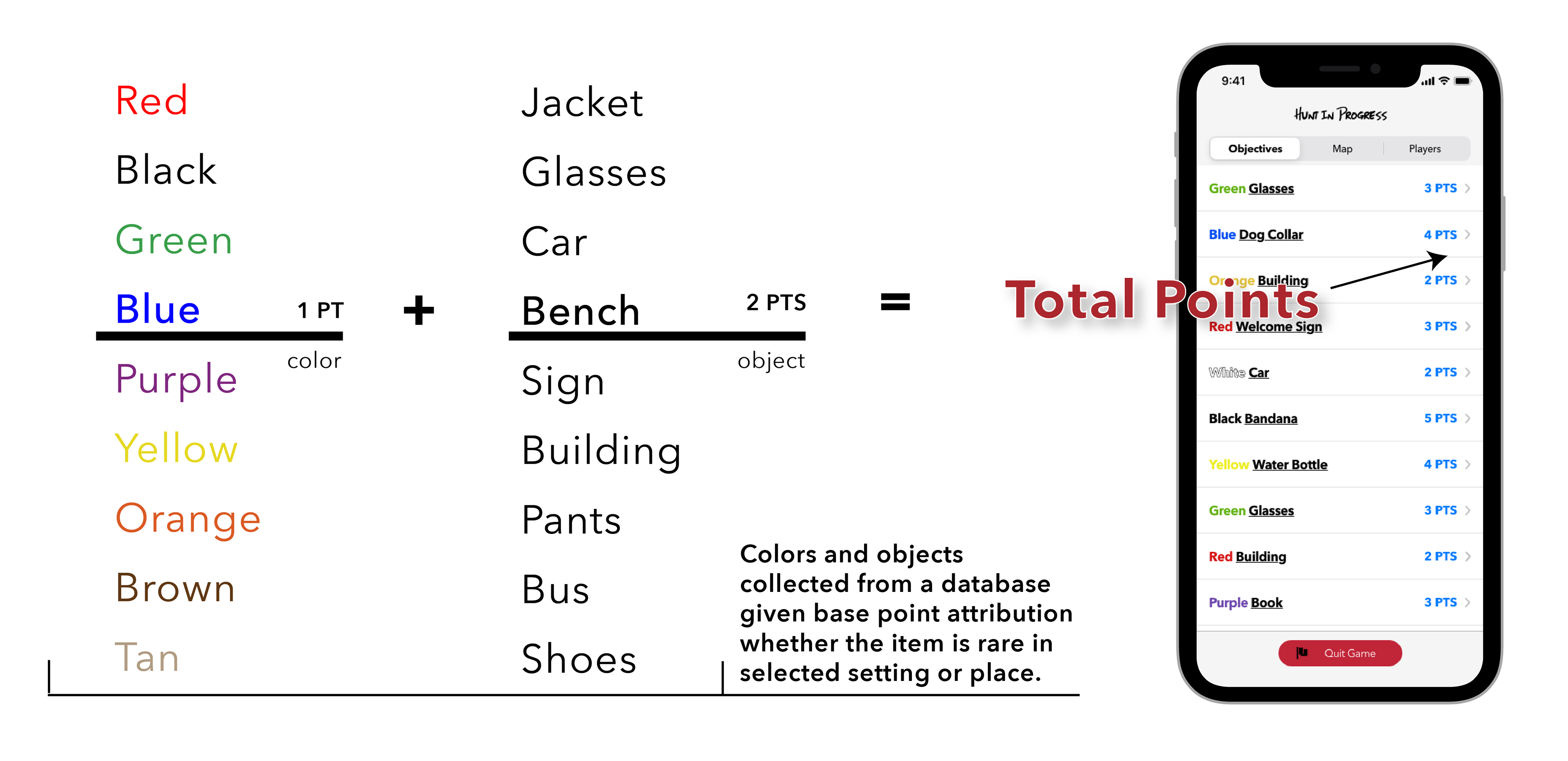
There was a lot more needed to consider when planning out some of the original game modes and features that would have been great solutions to the insights I found.
For example, in my Color Chaser game mode, there were randomized elements funneled through a database of values and objects. While random in nature, I would still have to attribute very specific values to those "random" features for it to function. Testing would also have been necessary and extensive to see if the execution would be feasible.
In Future Projects and More
Testing, Testing, and More Testing
For user research and testing - there can never be enough testing (technically). I believe that more testing during the ideation phase could have been warranted to prevent early oversights. I could've tested more frequently or at least waited till I had more content ready before testing so that more issues could be addressed to see their viability.
During user research, there could have been a better screening process on my part when finding participants so that I hit my key demographics. Having less suitable individuals for testing produced weaker results, though I could have reached out to participants afterward as well requesting an explanation of certain answers.
Final Words
Hello there UX Design!
Seeing as this was my first (conventional) UX design project, I'm aware that many areas could have been improved upon. There were many choices that I would not have committed to and planning would be completely different with the knowledge I currently have.
With more time and interest to invest, I believe this product could have been much better than it is currently. However, I'm happy in seeing my ideas brought to life and will consider this one of the best learning experiences for growth and future endeavors.
S P E C I A L T H A N K S